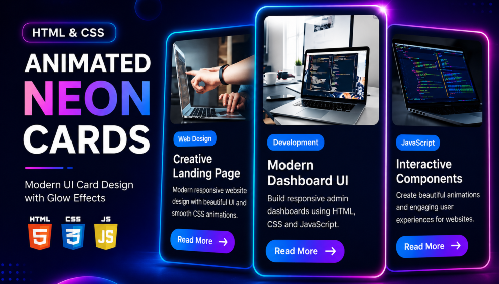


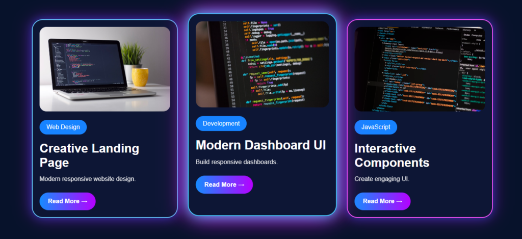
Creating visually attractive card layouts is one of the most important skills for every front-end developer. Whether you’re designing a portfolio, blog, landing page, agency website, or dashboard, modern card components help present content in a clean and engaging way. In this tutorial, you’ll learn how to build Animated Neon Cards with HTML CSS using only HTML, CSS, and a small amount of JavaScript. The final design features glowing neon borders, glassmorphism effects, responsive layouts, smooth hover animations, rounded images, and eye-catching gradient buttons that give your website a premium and futuristic appearance.
Unlike traditional card designs, neon UI cards combine vibrant gradients, soft glow effects, and subtle animations to create a modern user experience. These cards not only improve the overall visual appeal of your website but also encourage visitors to interact with your content. If you’re building a personal portfolio, technology blog, SaaS landing page, or online business website, this design style can instantly make your projects look more professional.
index.html
<!DOCTYPE html>
<html>
    <head>
        <meta charset="UTF-8">
        <meta name="viewport" content="width=device-width,initial-scale=1"><link rel="stylesheet" href="style.css">
        <title>Animated Neon Cards with HTML CSS Code By Mycodingtutorial</title>
    </head>
    <body>
        <section class="wrap">
            <div class="cards">
                <div class="card">
                    <img src="https://images.unsplash.com/photo-1517694712202-14dd9538aa97?w=800">
                    <span>Web Design</span>
                    <h2>Creative Landing Page</h2><p>Modern responsive website design.</p>
                    <a href="#">Read More →</a>
                </div>
                <div class="card">
                    <img src="https://images.unsplash.com/photo-1515879218367-8466d910aaa4?w=800">
                    <span>Development</span>
                    <h2>Modern Dashboard UI</h2>
                    <p>Build responsive dashboards.</p>
                    <a href="#">Read More →</a>
                </div>
                <div class="card">
                    <img src="https://images.unsplash.com/photo-1517180102446-f3ece451e9d8?w=800">
                    <span>JavaScript</span>
                    <h2>Interactive Components</h2>
                    <p>Create engaging UI.</p>
                    <a href="#">Read More →</a>
                </div>
            </div>
        </section>
        <script src="script.js"></script>
    </body>
</html>
You will also like this post
- Designing Stunning Team Member Card with HTML & CSS
- Responsive Service Card Design HTML & CSS
- Responsive Service Card Design using HTML & CSS
- Pricing Table CSS: Simple Tricks for a Better Design.
- Simple Code Tricks to Make Your Postcard Slider Look Better
- How to Make Animated Cards with HTML and CSS
style.css
/* ==========================
   RESET
========================== */

* {
    margin: 0;
    padding: 0;
    box-sizing: border-box;
}

/* ==========================
   BODY
========================== */

body {
    font-family: Arial, sans-serif;
    background: #07122b;
    color: #ffffff;
}

/* ==========================
   MAIN WRAPPER
========================== */

.wrap {
    min-height: 100vh;
    display: grid;
    place-items: center;
    padding: 40px;
}

/* ==========================
   CARD CONTAINER
========================== */

.cards {
    max-width: 1200px;
    display: grid;
    grid-template-columns: repeat(auto-fit, minmax(280px, 1fr));
    gap: 30px;
}

/* ==========================
   CARD
========================== */

.card {
    background: #0d1635;
    padding: 18px;
    border-radius: 28px;

    border: 2px solid #66ccff;

    box-shadow:
        0 0 25px rgba(34, 85, 255, 0.55),
        0 0 45px rgba(255, 0, 255, 0.35);

    transition: 0.4s ease;
}

/* ==========================
   CARD BORDER COLORS
========================== */

.card:nth-child(2) {
    border-color: #44ccff;
}

.card:nth-child(3) {
    border-color: #ff55ff;
}

/* ==========================
   CARD HOVER
========================== */

.card:hover {
    transform: translateY(-10px) scale(1.02);
}

/* ==========================
   CARD IMAGE
========================== */

.card img {
    width: 100%;
    height: 220px;
    object-fit: cover;
    border-radius: 18px;
}

/* ==========================
   CATEGORY LABEL
========================== */

.card span {
    display: inline-block;

    margin: 18px 0;

    padding: 10px 18px;

    background: #1783ff;

    border-radius: 20px;
}

/* ==========================
   CARD TITLE
========================== */

.card h2 {
    font-size: 2rem;
    margin-bottom: 10px;
}

/* ==========================
   CARD DESCRIPTION
========================== */

.card p {
    line-height: 1.7;
    opacity: 0.9;

    margin-bottom: 22px;
}

/* ==========================
   BUTTON
========================== */

.card a {
    display: inline-block;

    text-decoration: none;

    color: #ffffff;

    padding: 14px 22px;

    font-weight: bold;

    border-radius: 30px;

    background: linear-gradient(
        90deg,
        #158cff,
        #b600ff
    );
}

/* ===================================
   Large Tablets (992px)
=================================== */

@media (max-width: 992px) {

    .wrap {
        padding: 30px;
    }

    .cards {
        grid-template-columns: repeat(2, 1fr);
        gap: 25px;
    }

    .card h2 {
        font-size: 1.8rem;
    }

}

/* ===================================
   Tablets (768px)
=================================== */

@media (max-width: 768px) {

    .wrap {
        padding: 20px;
    }

    .cards {
        grid-template-columns: 1fr;
        gap: 25px;
    }

    .card {
        padding: 20px;
    }

    .card img {
        height: 250px;
    }

    .card h2 {
        font-size: 1.6rem;
    }

    .card p {
        font-size: 15px;
    }

    .card a {
        padding: 12px 22px;
        font-size: 15px;
    }

}

/* ===================================
   Mobile (576px)
=================================== */

@media (max-width: 576px) {

    .wrap {
        padding: 15px;
    }

    .cards {
        gap: 20px;
    }

    .card {
        padding: 16px;
        border-radius: 22px;
    }

    .card img {
        height: 220px;
        border-radius: 16px;
    }

    .card span {
        padding: 8px 16px;
        font-size: 13px;
    }

    .card h2 {
        font-size: 1.4rem;
        line-height: 1.4;
    }

    .card p {
        font-size: 14px;
        line-height: 1.7;
    }

    .card a {
        display: block;
        width: 100%;
        text-align: center;
        padding: 14px;
        font-size: 14px;
    }

}

/* ===================================
   Small Mobile (400px)
=================================== */

@media (max-width: 400px) {

    .wrap {
        padding: 12px;
    }

    .card {
        padding: 14px;
    }

    .card img {
        height: 190px;
    }

    .card h2 {
        font-size: 1.2rem;
    }

    .card p {
        font-size: 13px;
    }

    .card span {
        font-size: 12px;
        padding: 7px 14px;
    }

    .card a {
        font-size: 13px;
        padding: 12px;
    }

}
script.js
// ================================
// Select All Cards
// ================================

const cards = document.querySelectorAll(".card");

// ================================
// Mouse Move Effect
// ================================

cards.forEach((card) => {

    card.addEventListener("mousemove", () => {

        card.style.boxShadow = `
            0 0 35px #44ccff,
            0 0 60px #ff00ff
        `;

    });

});

// ================================
// Mouse Leave Effect
// ================================

cards.forEach((card) => {

    card.addEventListener("mouseleave", () => {

        card.style.boxShadow = `
            0 0 25px rgba(34, 85, 255, 0.55),
            0 0 45px rgba(255, 0, 255, 0.35)
        `;

    });

});
Conclusion
In this tutorial, you’ve learned how to create Animated Neon Cards with HTML CSS featuring glowing borders, responsive layouts, glassmorphism effects, gradient buttons, and smooth hover animations. This stylish UI component is ideal for portfolios, blogs, landing pages, agency websites, and modern business projects. Since the project is built using pure HTML, CSS, and JavaScript, it’s lightweight, easy to customize, beginner-friendly, and suitable for real-world web development. With just a few modifications, you can adapt these neon cards to match your own brand and create professional, eye-catching websites that leave a lasting impression on visitors.