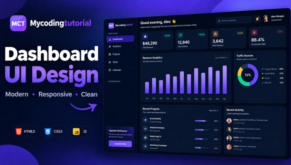


A Creative Dashboard UI is an important part of modern websites, admin panels, SaaS applications, project management systems, and analytics platforms. In this tutorial, we will create a modern and responsive dashboard using HTML and CSS, with a clean dark interface and smooth hover effects.
The dashboard includes a fixed sidebar navigation, responsive mobile menu, statistics cards, revenue analytics, traffic sources, project progress, recent activity, search box, notifications, and profile.
You can use this design as a starting point for your own admin dashboard, portfolio project, business website, analytics panel, or web application.
index.html
<!DOCTYPE html>
<html lang="en">
<head>
<meta charset="UTF-8">
<meta name="viewport" content="width=device-width, initial-scale=1.0">
<title>mycodingtutorial | Creative Dashboard</title>
<link rel="preconnect" href="https://fonts.googleapis.com">
<link rel="preconnect" href="https://fonts.gstatic.com" crossorigin>
<link href="https://fonts.googleapis.com/css2?family=Inter:wght@400;500;600;700;800&display=swap" rel="stylesheet">
<link rel="stylesheet" href="style.css">
</head>
<body>
<div class="dashboard">
<!-- =====================================
MOBILE OVERLAY
====================================== -->
<div
class="sidebar-overlay"
id="sidebarOverlay">
</div>
<!-- =====================================
SIDEBAR
====================================== -->
<aside
class="sidebar"
id="sidebar">
<!-- CLOSE -->
<button
class="sidebar-close"
id="sidebarClose"
aria-label="Close menu">
×
</button>
<!-- LOGO -->
<div class="logo">
<div class="logo-icon">
MCT
</div>
<h2>
Mycoding<span>tutorial</span>
</h2>
</div>
<!-- MAIN MENU -->
<div class="nav-title">
Main Menu
</div>
<nav class="nav">
<a href="#" class="active">
<i>⌂</i>
Dashboard
</a>
<a href="#">
<i>◈</i>
Analytics
</a>
<a href="#">
<i>▣</i>
Projects
</a>
<a href="#">
<i>♧</i>
Team
</a>
<a href="#">
<i>◷</i>
Calendar
</a>
</nav>
<br>
<!-- WORKSPACE -->
<div class="nav-title">
Workspace
</div>
<nav class="nav">
<a href="#">
<i>⚙</i>
Settings
</a>
<a href="#">
<i>?</i>
Help Center
</a>
</nav>
<!-- UPGRADE -->
<div class="sidebar-bottom">
<div class="upgrade">
<h4>
Upgrade Workspace
</h4>
<p>
Get more storage, advanced analytics
and premium features.
</p>
<button>
Upgrade Now
</button>
</div>
</div>
</aside>
<!-- =====================================
MAIN
====================================== -->
<main class="main">
<!-- TOPBAR -->
<header class="topbar">
<div class="welcome">
<!-- MOBILE MENU BUTTON -->
<button
class="mobile-menu"
id="mobileMenu"
aria-label="Open menu">
☰
</button>
<div>
<h1>
Good evening, Alex 👋
</h1>
<p>
Here's what's happening with your
mycodingtutorial workspace today.
</p>
</div>
</div>
<div class="top-actions">
<!-- SEARCH -->
<div class="search">
<span>
⌕
</span>
<input
type="text"
placeholder="Search anything...">
</div>
<!-- NOTIFICATION -->
<div
class="notification"
title="Notifications">
🔔
</div>
<!-- PROFILE -->
<div class="profile">
<img
class="avatar"
src="https://i.pravatar.cc/100?img=12"
alt="Profile">
<div class="profile-info">
<strong>
Alex Morgan
</strong>
<span>
Administrator
</span>
</div>
</div>
</div>
</header>
<!-- =====================================
STATS
====================================== -->
<section class="stats">
<div class="stat-card">
<div class="stat-top">
<div class="stat-icon">
◉
</div>
<span class="change">
+18.4%
</span>
</div>
<h3>
$48,290
</h3>
<p>
Total Revenue
</p>
</div>
<div class="stat-card">
<div class="stat-top">
<div class="stat-icon">
↗
</div>
<span class="change">
+12.8%
</span>
</div>
<h3>
12,840
</h3>
<p>
Total Visitors
</p>
</div>
<div class="stat-card">
<div class="stat-top">
<div class="stat-icon">
◫
</div>
<span class="change">
+7.2%
</span>
</div>
<h3>
3,642
</h3>
<p>
New Projects
</p>
</div>
<div class="stat-card">
<div class="stat-top">
<div class="stat-icon">
♢
</div>
<span class="change">
-3.1%
</span>
</div>
<h3>
86.4%
</h3>
<p>
Conversion Rate
</p>
</div>
</section>
<!-- =====================================
CHART + TRAFFIC
====================================== -->
<section class="content-grid">
<!-- REVENUE -->
<div class="panel">
<div class="panel-header">
<div>
<h2>
Revenue Analytics
</h2>
<span>
Monthly revenue overview
</span>
</div>
<div class="dropdown">
Last 12 Months ▾
</div>
</div>
<div class="chart">
<div class="bar-wrap">
<div class="bar"></div>
</div>
<div class="bar-wrap">
<div class="bar"></div>
</div>
<div class="bar-wrap">
<div class="bar"></div>
</div>
<div class="bar-wrap">
<div class="bar"></div>
</div>
<div class="bar-wrap">
<div class="bar"></div>
</div>
<div class="bar-wrap">
<div class="bar"></div>
</div>
<div class="bar-wrap">
<div class="bar"></div>
</div>
<div class="bar-wrap">
<div class="bar"></div>
</div>
<div class="bar-wrap">
<div class="bar"></div>
</div>
<div class="bar-wrap">
<div class="bar"></div>
</div>
<div class="bar-wrap">
<div class="bar"></div>
</div>
<div class="bar-wrap">
<div class="bar"></div>
</div>
</div>
<div class="months">
<span>Jan</span>
<span>Feb</span>
<span>Mar</span>
<span>Apr</span>
<span>May</span>
<span>Jun</span>
<span>Jul</span>
<span>Aug</span>
<span>Sep</span>
<span>Oct</span>
<span>Nov</span>
<span>Dec</span>
</div>
</div>
<!-- TRAFFIC -->
<div class="panel">
<div class="panel-header">
<div>
<h2>
Traffic Sources
</h2>
<span>
Where visitors come from
</span>
</div>
</div>
<div class="traffic">
<div class="donut"></div>
<div class="legend">
<div class="legend-item">
<div class="legend-name">
<span class="dot"></span>
Organic Search
</div>
<strong>
46%
</strong>
</div>
<div class="legend-item">
<div class="legend-name">
<span class="dot"></span>
Social Media
</div>
<strong>
27%
</strong>
</div>
<div class="legend-item">
<div class="legend-name">
<span class="dot"></span>
Direct
</div>
<strong>
15%
</strong>
</div>
<div class="legend-item">
<div class="legend-name">
<span class="dot"></span>
Referral
</div>
<strong>
12%
</strong>
</div>
</div>
</div>
</div>
</section>
<!-- =====================================
PROJECTS + ACTIVITY
====================================== -->
<section class="bottom-grid">
<!-- PROJECTS -->
<div class="panel">
<div class="panel-header">
<div>
<h2>
Recent Projects
</h2>
<span>
Your active workspace projects
</span>
</div>
<span>
View All →
</span>
</div>
<div class="project">
<div class="project-name">
<div class="project-icon">
◈
</div>
<div>
<strong>
Brand Identity
</strong>
<span>
Creative Design
</span>
</div>
</div>
<div class="progress">
<span style="width:86%"></span>
</div>
<div class="percent">
86%
</div>
</div>
<div class="project">
<div class="project-name">
<div class="project-icon">
◇
</div>
<div>
<strong>
Website Redesign
</strong>
<span>
Development
</span>
</div>
</div>
<div class="progress">
<span style="width:72%"></span>
</div>
<div class="percent">
72%
</div>
</div>
<div class="project">
<div class="project-name">
<div class="project-icon">
▣
</div>
<div>
<strong>
Mobile App UI
</strong>
<span>
UI/UX Design
</span>
</div>
</div>
<div class="progress">
<span style="width:58%"></span>
</div>
<div class="percent">
58%
</div>
</div>
<div class="project">
<div class="project-name">
<div class="project-icon">
✦
</div>
<div>
<strong>
Marketing Campaign
</strong>
<span>
Marketing
</span>
</div>
</div>
<div class="progress">
<span style="width:41%"></span>
</div>
<div class="percent">
41%
</div>
</div>
</div>
<!-- ACTIVITY -->
<div class="panel">
<div class="panel-header">
<div>
<h2>
Recent Activity
</h2>
<span>
Latest workspace updates
</span>
</div>
</div>
<div class="activity">
<img
class="activity-avatar"
src="https://i.pravatar.cc/100?img=32"
alt="Emma">
<div class="activity-text">
<strong>
Emma
</strong>
completed the Website Redesign task.
<time>
12 minutes ago
</time>
</div>
</div>
<div class="activity">
<img
class="activity-avatar"
src="https://i.pravatar.cc/100?img=47"
alt="David">
<div class="activity-text">
<strong>
David
</strong>
uploaded new project assets.
<time>
45 minutes ago
</time>
</div>
</div>
<div class="activity">
<img
class="activity-avatar"
src="https://i.pravatar.cc/100?img=44"
alt="Sophia">
<div class="activity-text">
<strong>
Sophia
</strong>
created a new design project.
<time>
2 hours ago
</time>
</div>
</div>
<div class="activity">
<img
class="activity-avatar"
src="https://i.pravatar.cc/100?img=14"
alt="James">
<div class="activity-text">
<strong>
James
</strong>
joined your workspace.
<time>
4 hours ago
</time>
</div>
</div>
</div>
</section>
</main>
</div>
<!-- =====================================
MOBILE SIDEBAR JAVASCRIPT
====================================== -->
<script>
const mobileMenu =
document.getElementById("mobileMenu");
const sidebar =
document.getElementById("sidebar");
const sidebarClose =
document.getElementById("sidebarClose");
const sidebarOverlay =
document.getElementById("sidebarOverlay");
/* OPEN SIDEBAR */
function openSidebar() {
sidebar.classList.add("active");
sidebarOverlay.classList.add("active");
document.body.classList.add("sidebar-open");
}
/* CLOSE SIDEBAR */
function closeSidebar() {
sidebar.classList.remove("active");
sidebarOverlay.classList.remove("active");
document.body.classList.remove("sidebar-open");
}
/* MENU BUTTON */
mobileMenu.addEventListener(
"click",
openSidebar
);
/* CLOSE BUTTON */
sidebarClose.addEventListener(
"click",
closeSidebar
);
/* OVERLAY CLICK */
sidebarOverlay.addEventListener(
"click",
closeSidebar
);
/* CLOSE AFTER NAVIGATION */
document.querySelectorAll(".nav a").forEach(
function(link) {
link.addEventListener(
"click",
function() {
if (
window.innerWidth <= 650
) {
closeSidebar();
}
}
);
}
);
/* ESC KEY */
document.addEventListener(
"keydown",
function(event) {
if (event.key === "Escape") {
closeSidebar();
}
}
);
/* RESET WHEN RESIZING */
window.addEventListener(
"resize",
function() {
if (window.innerWidth > 650) {
closeSidebar();
}
}
);
</script>
</body>
</html>style.css
/* =========================
   RESET
========================= */

* {
    margin: 0;
    padding: 0;
    box-sizing: border-box;
}

:root {
    --bg: #070a13;
    --sidebar: #0d111d;
    --card: #111725;
    --card-hover: #151d2e;
    --border: #20283a;
    --text: #ffffff;
    --muted: #8d97aa;

    --primary: #7c5cff;
    --primary-light: #a18cff;

    --green: #32d583;
    --orange: #ffb020;
    --red: #ff5d73;

    --shadow: 0 15px 40px rgba(0,0,0,.25);
}

html {
    scroll-behavior: smooth;
}

body {
    min-height: 100vh;
    font-family: "Inter", sans-serif;
    background: var(--bg);
    color: var(--text);
    font-size: 14px;
}

body.sidebar-open {
    overflow: hidden;
}

/* =========================
   DASHBOARD
========================= */

.dashboard {
    display: flex;
    min-height: 100vh;
}

/* =========================
   SIDEBAR
========================= */

.sidebar {
    width: 255px;
    min-height: 100vh;

    background: var(--sidebar);
    border-right: 1px solid var(--border);

    padding: 25px 18px;

    position: fixed;
    top: 0;
    left: 0;
    bottom: 0;

    z-index: 1000;

    transition:
        transform .35s ease,
        box-shadow .35s ease;
}

/* =========================
   LOGO
========================= */

.logo {
    display: flex;
    align-items: center;
    gap: 12px;
    padding: 0 10px 35px;
}

.logo-icon {
    width: 40px;
    height: 40px;

    border-radius: 11px;

    display: flex;
    align-items: center;
    justify-content: center;

    background:
        linear-gradient(
            135deg,
            #7c5cff,
            #bd5cff
        );

    color: #fff;

    font-size: 14px;
    font-weight: 800;

    box-shadow:
        0 0 25px rgba(124,92,255,.35);

    position: relative;
    overflow: hidden;
}

.logo-icon::before {
    content: "";

    position: absolute;

    width: 80px;
    height: 80px;

    background: rgba(255,255,255,.12);

    transform: rotate(45deg);

    top: -55px;
    left: -45px;

    transition: .5s;
}

.logo:hover .logo-icon::before {
    left: 55px;
}

.logo h2 {
    font-size: 18px;
    letter-spacing: -.7px;
    color: #fff;
}

.logo h2 span {
    color: var(--primary-light);
}

/* =========================
   MOBILE CLOSE BUTTON
========================= */

.sidebar-close {
    display: none;

    position: absolute;

    top: 20px;
    right: 18px;

    width: 34px;
    height: 34px;

    border: 1px solid var(--border);

    background: #151b2a;
    color: #fff;

    border-radius: 8px;

    font-size: 20px;

    cursor: pointer;

    align-items: center;
    justify-content: center;

    transition: .3s;
}

.sidebar-close:hover {
    background: var(--primary);
    border-color: var(--primary);
}

/* =========================
   NAVIGATION
========================= */

.nav-title {
    color: #586278;

    font-size: 14px;
    font-weight: 700;

    text-transform: uppercase;

    letter-spacing: 1px;

    padding: 0 12px 12px;
}

.nav {
    display: flex;
    flex-direction: column;
    gap: 6px;
}

.nav a {
    text-decoration: none;

    color: var(--muted);

    padding: 12px 13px;

    border-radius: 10px;

    display: flex;
    align-items: center;

    gap: 13px;

    font-size: 14px;
    font-weight: 500;

    transition: .3s;
}

.nav a i {
    width: 20px;

    text-align: center;

    font-style: normal;

    font-size: 18px;
}

.nav a:hover {
    background: rgba(124,92,255,.10);

    color: #fff;

    transform: translateX(3px);
}

.nav a.active {
    background: rgba(124,92,255,.14);

    color: #fff;

    box-shadow:
        inset 3px 0 0 var(--primary);
}

/* =========================
   SIDEBAR BOTTOM
========================= */

.sidebar-bottom {
    position: absolute;

    left: 18px;
    right: 18px;
    bottom: 25px;
}

.upgrade {
    background:
        radial-gradient(
            circle at top right,
            rgba(124,92,255,.16),
            transparent 45%
        ),
        linear-gradient(
            145deg,
            #17132c,
            #121625
        );

    border: 1px solid #292344;

    border-radius: 14px;

    padding: 16px;

    box-shadow: var(--shadow);
}

.upgrade h4 {
    font-size: 15px;
    margin-bottom: 7px;
}

.upgrade p {
    font-size: 14px;

    color: var(--muted);

    line-height: 1.6;

    margin-bottom: 13px;
}

.upgrade button {
    border: 0;

    background: var(--primary);

    color: #fff;

    width: 100%;

    padding: 10px;

    border-radius: 8px;

    cursor: pointer;

    font-size: 14px;
    font-weight: 600;

    transition: .3s;
}

.upgrade button:hover {
    background: #9279ff;

    transform: translateY(-2px);

    box-shadow:
        0 8px 20px rgba(124,92,255,.25);
}

/* =========================
   OVERLAY
========================= */

.sidebar-overlay {
    display: none;

    position: fixed;

    inset: 0;

    background: rgba(0,0,0,.65);

    backdrop-filter: blur(3px);

    z-index: 900;
}

/* =========================
   MAIN
========================= */

.main {
    margin-left: 255px;

    width: calc(100% - 255px);

    padding: 27px 30px;
}

/* =========================
   TOPBAR
========================= */

.topbar {
    display: flex;

    align-items: center;

    justify-content: space-between;

    margin-bottom: 28px;
}

.welcome {
    display: flex;

    align-items: center;

    gap: 12px;
}

.welcome h1 {
    font-size: 25px;

    margin-bottom: 5px;

    letter-spacing: -.8px;
}

.welcome p {
    color: var(--muted);

    font-size: 14px;
}

.top-actions {
    display: flex;

    align-items: center;

    gap: 12px;
}

/* =========================
   SEARCH
========================= */

.search {
    width: 235px;
    height: 40px;

    border: 1px solid var(--border);

    background: var(--card);

    border-radius: 9px;

    display: flex;
    align-items: center;

    padding: 0 13px;

    gap: 9px;

    transition: .3s;
}

.search:focus-within {
    border-color: var(--primary);
}

.search span {
    color: #667085;

    font-size: 18px;
}

.search input {
    background: none;

    border: 0;

    outline: 0;

    color: #fff;

    width: 100%;

    font-size: 14px;
}

.search input::placeholder {
    color: #667085;
}

/* =========================
   NOTIFICATION
========================= */

.notification {
    width: 40px;
    height: 40px;

    border: 1px solid var(--border);

    background: var(--card);

    border-radius: 9px;

    display: flex;

    justify-content: center;
    align-items: center;

    cursor: pointer;

    transition: .3s;

    position: relative;

    font-size: 18px;
}

.notification:hover {
    border-color: var(--primary);

    transform: translateY(-2px);
}

.notification::after {
    content: "";

    position: absolute;

    width: 7px;
    height: 7px;

    border-radius: 50%;

    background: var(--red);

    top: 8px;
    right: 8px;
}

/* =========================
   PROFILE
========================= */

.profile {
    display: flex;

    align-items: center;

    gap: 9px;
}

.avatar {
    width: 40px;
    height: 40px;

    border-radius: 50%;

    object-fit: cover;

    border: 2px solid #2b3448;
}

.profile-info strong {
    display: block;

    font-size: 14px;
}

.profile-info span {
    color: var(--muted);

    font-size: 14px;
}

/* =========================
   MOBILE MENU
========================= */

.mobile-menu {
    display: none;

    width: 40px;
    height: 40px;

    border: 1px solid var(--border);

    background: var(--card);

    color: #fff;

    border-radius: 9px;

    cursor: pointer;

    font-size: 20px;

    transition: .3s;
}

.mobile-menu:hover {
    border-color: var(--primary);

    background: #171d2d;
}

/* =========================
   STATS
========================= */

.stats {
    display: grid;

    grid-template-columns:
        repeat(4, 1fr);

    gap: 17px;

    margin-bottom: 20px;
}

.stat-card {
    background: var(--card);

    border: 1px solid var(--border);

    border-radius: 14px;

    padding: 19px;

    transition: .3s;

    position: relative;

    overflow: hidden;
}

.stat-card::before {
    content: "";

    position: absolute;

    width: 90px;
    height: 90px;

    border-radius: 50%;

    background: rgba(124,92,255,.05);

    right: -35px;
    top: -35px;

    transition: .4s;
}

.stat-card:hover {
    transform: translateY(-4px);

    background: var(--card-hover);

    border-color: #343e56;

    box-shadow: var(--shadow);
}

.stat-card:hover::before {
    transform: scale(1.4);
}

.stat-top {
    display: flex;

    justify-content: space-between;

    align-items: center;
}

.stat-icon {
    width: 38px;
    height: 38px;

    border-radius: 10px;

    background: rgba(124,92,255,.13);

    display: flex;

    align-items: center;
    justify-content: center;

    font-size: 18px;
}

.stat-card:nth-child(2) .stat-icon {
    background: rgba(50,213,131,.11);
}

.stat-card:nth-child(3) .stat-icon {
    background: rgba(255,176,32,.11);
}

.stat-card:nth-child(4) .stat-icon {
    background: rgba(255,93,115,.11);
}

.change {
    font-size: 14px;

    color: var(--green);

    background: rgba(50,213,131,.08);

    padding: 5px 7px;

    border-radius: 6px;
}

.stat-card:nth-child(3) .change {
    color: var(--orange);
}

.stat-card:nth-child(4) .change {
    color: var(--red);
}

.stat-card h3 {
    font-size: 24px;

    margin-top: 16px;

    margin-bottom: 5px;
}

.stat-card p {
    color: var(--muted);

    font-size: 14px;
}

/* =========================
   CONTENT GRID
========================= */

.content-grid {
    display: grid;

    grid-template-columns: 2fr 1fr;

    gap: 20px;

    margin-bottom: 20px;
}

.panel {
    background: var(--card);

    border: 1px solid var(--border);

    border-radius: 14px;

    padding: 20px;

    transition: .3s;
}

.panel:hover {
    border-color: #293348;
}

.panel-header {
    display: flex;

    align-items: center;

    justify-content: space-between;

    margin-bottom: 22px;
}

.panel-header h2 {
    font-size: 16px;

    margin-bottom: 5px;
}

.panel-header span {
    color: var(--muted);

    font-size: 14px;
}

.dropdown {
    border: 1px solid var(--border);

    padding: 7px 10px;

    border-radius: 7px;

    color: var(--muted);

    font-size: 14px;

    cursor: pointer;
}

/* =========================
   CHART
========================= */

.chart {
    height: 245px;

    position: relative;

    display: flex;

    align-items: flex-end;

    gap: 13px;

    padding: 15px 5px 25px;

    border-bottom: 1px solid var(--border);

    background:
        repeating-linear-gradient(
            to bottom,
            transparent 0,
            transparent 48px,
            rgba(255,255,255,.035) 49px
        );
}

.bar-wrap {
    height: 100%;

    flex: 1;

    display: flex;

    align-items: flex-end;

    justify-content: center;
}

.bar {
    width: 65%;

    border-radius: 6px 6px 0 0;

    background:
        linear-gradient(
            to top,
            var(--primary),
            #a58fff
        );

    min-height: 25px;

    transition: .4s;
}

.bar:hover {
    filter: brightness(1.2);

    transform: scaleY(1.04);
}

.bar-wrap:nth-child(1) .bar {
    height: 42%;
}

.bar-wrap:nth-child(2) .bar {
    height: 58%;
}

.bar-wrap:nth-child(3) .bar {
    height: 48%;
}

.bar-wrap:nth-child(4) .bar {
    height: 72%;
}

.bar-wrap:nth-child(5) .bar {
    height: 61%;
}

.bar-wrap:nth-child(6) .bar {
    height: 82%;
}

.bar-wrap:nth-child(7) .bar {
    height: 68%;
}

.bar-wrap:nth-child(8) .bar {
    height: 92%;
}

.bar-wrap:nth-child(9) .bar {
    height: 75%;
}

.bar-wrap:nth-child(10) .bar {
    height: 96%;
}

.bar-wrap:nth-child(11) .bar {
    height: 82%;
}

.bar-wrap:nth-child(12) .bar {
    height: 100%;
}

.months {
    display: flex;

    gap: 13px;

    padding: 9px 5px 0;
}

.months span {
    flex: 1;

    text-align: center;

    color: #697389;

    font-size: 14px;
}

/* =========================
   TRAFFIC
========================= */

.traffic {
    display: flex;

    align-items: center;

    gap: 25px;
}

.donut {
    width: 145px;
    height: 145px;

    flex-shrink: 0;

    border-radius: 50%;

    background:
        conic-gradient(
            var(--primary) 0 46%,
            var(--green) 46% 73%,
            var(--orange) 73% 88%,
            #30394d 88% 100%
        );

    display: flex;

    align-items: center;
    justify-content: center;

    animation: rotateChart 1s ease;
}

@keyframes rotateChart {

    from {
        transform: rotate(-90deg);
    }

    to {
        transform: rotate(0);
    }
}

.donut::after {
    content: "72%";

    width: 94px;
    height: 94px;

    background: var(--card);

    border-radius: 50%;

    display: flex;

    align-items: center;
    justify-content: center;

    font-size: 20px;

    font-weight: 700;
}

.legend {
    display: flex;

    flex-direction: column;

    gap: 14px;

    flex: 1;
}

.legend-item {
    display: flex;

    align-items: center;

    justify-content: space-between;

    gap: 20px;
}

.legend-name {
    display: flex;

    align-items: center;

    gap: 8px;

    color: var(--muted);

    font-size: 14px;
}

.dot {
    width: 8px;
    height: 8px;

    border-radius: 50%;

    background: var(--primary);
}

.legend-item:nth-child(2) .dot {
    background: var(--green);
}

.legend-item:nth-child(3) .dot {
    background: var(--orange);
}

.legend-item:nth-child(4) .dot {
    background: #30394d;
}

.legend-item strong {
    font-size: 14px;
}

/* =========================
   BOTTOM GRID
========================= */

.bottom-grid {
    display: grid;

    grid-template-columns: 1.5fr 1fr;

    gap: 20px;
}

/* =========================
   PROJECT
========================= */

.project {
    display: grid;

    grid-template-columns:
        1fr 90px 45px;

    align-items: center;

    gap: 15px;

    padding: 13px 0;

    border-bottom: 1px solid var(--border);
}

.project:last-child {
    border-bottom: 0;
}

.project-name {
    display: flex;

    align-items: center;

    gap: 10px;
}

.project-icon {
    width: 32px;
    height: 32px;

    border-radius: 8px;

    background: #1d2536;

    display: flex;

    justify-content: center;
    align-items: center;

    font-size: 16px;
}

.project-name strong {
    font-size: 14px;

    display: block;

    margin-bottom: 3px;
}

.project-name span {
    color: var(--muted);

    font-size: 14px;
}

.progress {
    height: 6px;

    border-radius: 20px;

    background: #252e41;

    overflow: hidden;
}

.progress span {
    height: 100%;

    display: block;

    background:
        linear-gradient(
            90deg,
            var(--primary),
            var(--primary-light)
        );

    border-radius: 20px;
}

.percent {
    color: var(--muted);

    font-size: 14px;

    text-align: right;
}

/* =========================
   ACTIVITY
========================= */

.activity {
    display: flex;

    gap: 11px;

    padding: 13px 0;

    border-bottom: 1px solid var(--border);
}

.activity:last-child {
    border-bottom: 0;
}

.activity-avatar {
    width: 32px;
    height: 32px;

    border-radius: 50%;

    object-fit: cover;
}

.activity-text {
    font-size: 14px;

    line-height: 1.6;

    color: var(--muted);
}

.activity-text strong {
    color: #fff;
}

.activity-text time {
    display: block;

    color: #596378;

    margin-top: 3px;

    font-size: 14px;
}

/* =========================
   TABLET
========================= */

@media (max-width: 1100px) {

    .stats {
        grid-template-columns:
            repeat(2, 1fr);
    }

    .content-grid,
    .bottom-grid {
        grid-template-columns: 1fr;
    }
}

/* =========================
   SMALL LAPTOP
========================= */

@media (max-width: 800px) {

    .sidebar {
        width: 230px;
    }

    .main {
        margin-left: 230px;

        width: calc(100% - 230px);

        padding: 20px;
    }

    .search {
        width: 170px;
    }

    .profile-info {
        display: none;
    }
}

/* =========================
   MOBILE SIDEBAR
========================= */

@media (max-width: 650px) {

    .sidebar {
        display: block;

        width: 280px;

        transform: translateX(-100%);

        box-shadow: none;

        overflow-y: auto;
    }

    .sidebar.active {
        transform: translateX(0);

        box-shadow:
            20px 0 60px rgba(0,0,0,.45);
    }

    .sidebar-close {
        display: flex;
    }

    .sidebar-overlay {
        display: block;

        opacity: 0;

        visibility: hidden;

        transition:
            opacity .3s ease,
            visibility .3s ease;
    }

    .sidebar-overlay.active {
        opacity: 1;

        visibility: visible;
    }

    .main {
        margin-left: 0;

        width: 100%;

        padding: 16px;
    }

    .mobile-menu {
        display: flex;

        align-items: center;

        justify-content: center;

        flex-shrink: 0;
    }

    .topbar {
        align-items: flex-start;

        margin-bottom: 20px;
    }

    .welcome {
        gap: 8px;
    }

    .welcome h1 {
        font-size: 19px;
    }

    .welcome p {
        display: none;
    }

    .top-actions {
        gap: 6px;
    }

    .search {
        display: none;
    }

    .notification {
        width: 37px;
        height: 37px;
    }

    .avatar {
        width: 37px;
        height: 37px;
    }

    .stats {
        grid-template-columns:
            1fr 1fr;

        gap: 10px;
    }

    .stat-card {
        padding: 14px;
    }

    .stat-card h3 {
        font-size: 19px;
    }

    .stat-card p {
        font-size: 14px;
    }

    .stat-icon {
        width: 34px;
        height: 34px;

        font-size: 16px;
    }

    .change {
        font-size: 14px;
    }

    .content-grid {
        gap: 12px;
    }

    .bottom-grid {
        gap: 12px;
    }

    .panel {
        padding: 15px;
    }

    .panel-header h2 {
        font-size: 16px;
    }

    .panel-header span {
        font-size: 14px;
    }

    .dropdown {
        font-size: 14px;
    }

    .chart {
        height: 190px;

        gap: 7px;
    }

    .months {
        gap: 7px;
    }

    .months span {
        font-size: 14px;
    }

    .traffic {
        flex-direction: column;

        align-items: center;

        gap: 20px;
    }

    .legend {
        width: 100%;
    }

    .legend-name,
    .legend-item strong {
        font-size: 14px;
    }

    .project {
        grid-template-columns:
            1fr 65px;
    }

    .percent {
        display: none;
    }

    .project-name strong,
    .project-name span {
        font-size: 14px;
    }

    .activity-text,
    .activity-text time {
        font-size: 14px;
    }
}

/* =========================
   VERY SMALL MOBILE
========================= */

@media (max-width: 400px) {

    .main {
        padding: 12px;
    }

    .welcome h1 {
        font-size: 16px;
    }

    .stats {
        gap: 8px;
    }

    .stat-card {
        padding: 12px;
    }

    .stat-card h3 {
        font-size: 17px;
    }

    .change {
        font-size: 14px;
    }

    .chart {
        height: 165px;

        gap: 5px;
    }

    .months span {
        font-size: 14px;
    }

    .donut {
        width: 125px;
        height: 125px;
    }

    .donut::after {
        width: 82px;
        height: 82px;

        font-size: 18px;
    }
}
Conclusion
In this tutorial, we created a modern Creative Dashboard UI Using HTML & CSS with responsive layouts, sidebar navigation, statistics cards, revenue analytics, traffic sources, project progress, recent activity, and a mobile-friendly navigation system.
The project demonstrates how HTML, CSS Grid, Flexbox, CSS gradients, pseudo-elements, media queries, and JavaScript can be combined to create a professional dashboard interface without relying on a large UI framework.
You can use this dashboard as a foundation for your next admin panel, analytics application, SaaS project, portfolio website, or web development project.
If you are learning HTML and CSS, this project is also a useful way to practice responsive design, CSS Grid, Flexbox, animations, cards, navigation, and modern UI/UX techniques.
Try customizing the colors, statistics, projects, user profile, and navigation items to create your own unique dashboard design.