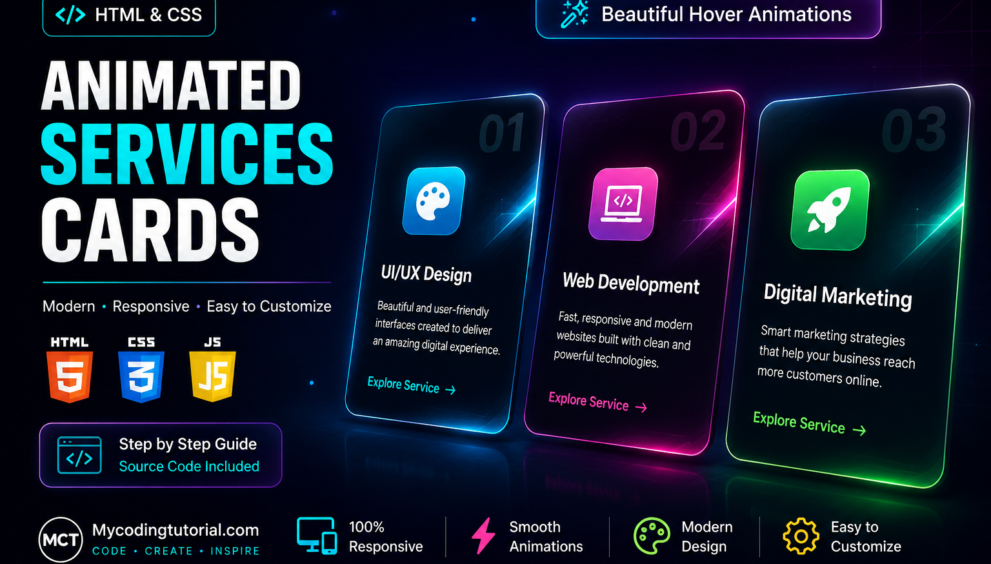


Learn how to create a modern animated services card section using HTML and CSS from scratch. In this tutorial, we will build a professional services section featuring beautiful cards, animated icons, glowing hover effects, gradient backgrounds, smooth transitions, and a fully responsive layout.
This Animated Services Cards design is perfect for business websites, agency websites, portfolio websites, SaaS landing pages, digital marketing websites, creative studios, and personal projects. The design uses pure HTML and CSS, so you don’t need any external JavaScript library or framework.
Each service card includes a modern icon area, service title, description, numbered element, and an animated call-to-action link. When the user hovers over a card, it smoothly moves upward while a colorful glow appears around the card. A moving shine animation also creates a premium interactive effect.
index.html
<!DOCTYPE html>
<html lang="en">
<head>
    <meta charset="UTF-8">
    <meta name="viewport" content="width=device-width, initial-scale=1.0">
    <link rel="stylesheet" href="style.css">
    <title>Animated Services Cards - MyCodingTutorial</title>
</head>

<body>

    <section class="services">

        <div class="heading">

            <span>What We Do</span>

            <h1>Our Creative Services</h1>

            <p>
                Powerful digital solutions designed to grow your brand.
            </p>

        </div>


        <div class="cards">

            <!-- Card 1 -->
            <div class="card">

                <div class="number">01</div>

                <div class="icon">
                    🎨
                </div>

                <h2>UI/UX Design</h2>

                <p>
                    Beautiful and user-friendly interfaces created
                    to deliver an amazing digital experience.
                </p>

                <a href="#">
                    Explore Service <span>→</span>
                </a>

            </div>


            <!-- Card 2 -->
            <div class="card">

                <div class="number">02</div>

                <div class="icon">
                    💻
                </div>

                <h2>Web Development</h2>

                <p>
                    Fast, responsive and modern websites built
                    with clean and powerful technologies.
                </p>

                <a href="#">
                    Explore Service <span>→</span>
                </a>

            </div>


            <!-- Card 3 -->
            <div class="card">

                <div class="number">03</div>

                <div class="icon">
                    🚀
                </div>

                <h2>Digital Marketing</h2>

                <p>
                    Smart marketing strategies that help your
                    business reach more customers online.
                </p>

                <a href="#">
                    Explore Service <span>→</span>
                </a>

            </div>

        </div>

    </section>

</body>
</html>
You will also like this post
- Designing Stunning Team Member Card with HTML & CSS
- Responsive Service Card Design HTML & CSS
- Responsive Service Card Design using HTML & CSS
- Pricing Table CSS: Simple Tricks for a Better Design.
- Simple Code Tricks to Make Your Postcard Slider Look Better
- How to Make Animated Cards with HTML and CSS
style.css
* {
    margin: 0;
    padding: 0;
    box-sizing: border-box;
}


/* =========================
   Body
========================= */

body {
    min-height: 100vh;

    font-family: Arial, sans-serif;

    background: #070b18;

    color: #fff;

    display: flex;

    justify-content: center;

    align-items: center;

    padding: 60px 20px;
}


/* =========================
   Services
========================= */

.services {
    width: 1100px;
    max-width: 100%;
}


/* =========================
   Heading
========================= */

.heading {
    text-align: center;

    margin-bottom: 45px;
}

.heading span {
    color: #00e5ff;

    font-size: 14px;

    font-weight: 700;

    letter-spacing: 3px;

    text-transform: uppercase;
}

.heading h1 {
    margin-top: 12px;

    font-size: 42px;

    line-height: 1.2;
}

.heading p {
    margin-top: 12px;

    color: #8992aa;

    font-size: 16px;
}


/* =========================
   Cards Grid
========================= */

.cards {
    display: grid;

    grid-template-columns: repeat(3, 1fr);

    gap: 25px;
}


/* =========================
   Card
========================= */

.card {
    position: relative;

    padding: 35px 28px;

    min-height: 310px;

    overflow: hidden;

    border-radius: 22px;

    background:
        linear-gradient(
            145deg,
            #11182c,
            #080d1c
        );

    border: 1px solid rgba(255, 255, 255, 0.08);

    transition:
        transform 0.5s ease,
        border-color 0.5s ease,
        box-shadow 0.5s ease;

    isolation: isolate;
}


/* =========================
   Default Glowing Effect
========================= */

.card::before {
    content: "";

    position: absolute;

    width: 180px;

    height: 180px;

    background: #00e5ff;

    filter: blur(70px);

    opacity: 0;

    top: -70px;

    right: -70px;

    transition: 0.5s ease;

    z-index: -1;

    pointer-events: none;
}

.card:hover::before {
    opacity: 0.35;
}


/* =========================
   Card 2 Pink Glow
========================= */

.card:nth-child(2)::before {
    background: #ff3cac;
}


/* =========================
   Card 3 Green Glow
========================= */

.card:nth-child(3)::before {
    background: #7cff67;
}


/* =========================
   Moving Shine
========================= */

.card::after {
    content: "";

    position: absolute;

    width: 80px;

    height: 400px;

    top: -50px;

    left: -150px;

    background: rgba(255, 255, 255, 0.12);

    transform: rotate(25deg);

    transition: 0.7s ease;

    z-index: 2;

    pointer-events: none;
}

.card:hover::after {
    left: 110%;
}


/* =========================
   Card 1 Hover - CYAN
========================= */

.card:nth-child(1):hover {
    transform: translateY(-12px);

    border-color: #00e5ff;

    box-shadow:
        0 20px 60px rgba(0, 229, 255, 0.25),
        0 0 25px rgba(0, 229, 255, 0.15);
}


/* =========================
   Card 2 Hover - PINK
========================= */

.card:nth-child(2):hover {
    transform: translateY(-12px);

    border-color: #ff3cac;

    box-shadow:
        0 20px 60px rgba(255, 60, 172, 0.25),
        0 0 25px rgba(255, 60, 172, 0.15);
}


/* =========================
   Card 3 Hover - GREEN
========================= */

.card:nth-child(3):hover {
    transform: translateY(-12px);

    border-color: #7cff67;

    box-shadow:
        0 20px 60px rgba(124, 255, 103, 0.25),
        0 0 25px rgba(124, 255, 103, 0.15);
}


/* =========================
   Number
========================= */

.number {
    position: absolute;

    right: 22px;

    top: 18px;

    font-size: 55px;

    font-weight: 800;

    color: rgba(255, 255, 255, 0.035);

    pointer-events: none;
}


/* =========================
   Icons
========================= */

.icon {
    width: 70px;

    height: 70px;

    border-radius: 18px;

    display: flex;

    align-items: center;

    justify-content: center;

    font-size: 32px;

    background:
        linear-gradient(
            135deg,
            #00e5ff,
            #0066ff
        );

    box-shadow:
        0 10px 30px rgba(0, 229, 255, 0.25);

    animation:
        float 3s ease-in-out infinite;
}


/* =========================
   Card 2 Icon - PINK
========================= */

.card:nth-child(2) .icon {
    background:
        linear-gradient(
            135deg,
            #ff3cac,
            #784ba0
        );

    box-shadow:
        0 10px 30px rgba(255, 60, 172, 0.25);

    animation-delay: 0.4s;
}


/* =========================
   Card 3 Icon - GREEN
========================= */

.card:nth-child(3) .icon {
    background:
        linear-gradient(
            135deg,
            #7cff67,
            #00b894
        );

    box-shadow:
        0 10px 30px rgba(124, 255, 103, 0.20);

    animation-delay: 0.8s;
}


/* =========================
   Floating Animation
========================= */

@keyframes float {

    0%,
    100% {
        transform: translateY(0);
    }

    50% {
        transform: translateY(-8px);
    }
}


/* =========================
   Card Title
========================= */

.card h2 {
    position: relative;

    z-index: 3;

    margin-top: 28px;

    font-size: 23px;
}


/* =========================
   Card Description
========================= */

.card p {
    position: relative;

    z-index: 3;

    color: #b8b8bb;

    line-height: 1.7;

    margin-top: 13px;
}


/* =========================
   Buttons
========================= */

.card a {
    position: relative;

    z-index: 3;

    display: inline-flex;

    align-items: center;

    gap: 8px;

    margin-top: 25px;

    text-decoration: none;

    font-weight: 600;

    transition:
        gap 0.3s ease,
        color 0.3s ease,
        text-shadow 0.3s ease;
}


/* =========================
   Card 1 Button - CYAN
========================= */

.card:nth-child(1) a {
    color: #00e5ff;
}

.card:nth-child(1) a:hover {
    color: #00e5ff;

    gap: 14px;

    text-shadow:
        0 0 10px rgba(0, 229, 255, 0.8);
}


/* =========================
   Card 2 Button - PINK
========================= */

.card:nth-child(2) a {
    color: #ff3cac;
}

.card:nth-child(2) a:hover {
    color: #ff3cac;

    gap: 14px;

    text-shadow:
        0 0 10px rgba(255, 60, 172, 0.8);
}


/* =========================
   Card 3 Button - GREEN
========================= */

.card:nth-child(3) a {
    color: #7cff67;
}

.card:nth-child(3) a:hover {
    color: #7cff67;

    gap: 14px;

    text-shadow:
        0 0 10px rgba(124, 255, 103, 0.8);
}


/* =========================
   Tablet
========================= */

@media (max-width: 850px) {

    .cards {
        grid-template-columns: repeat(2, 1fr);
    }

}


/* =========================
   Mobile
========================= */

@media (max-width: 580px) {

    body {
        padding: 40px 15px;
    }

    .cards {
        grid-template-columns: 1fr;
    }

    .heading h1 {
        font-size: 32px;
    }

    .heading p {
        font-size: 14px;
    }

    .card {
        min-height: 300px;
    }

}
Final Result
The final result is a clean, modern, and interactive services section that can immediately be integrated into an existing website. The combination of animated icons, glowing effects, gradient colors, hover transitions, and responsive design gives the cards a professional appearance.
If you’re looking for a simple way to make your website’s services section more engaging, this Animated Services Cards Using HTML & CSS project is a great starting point.