
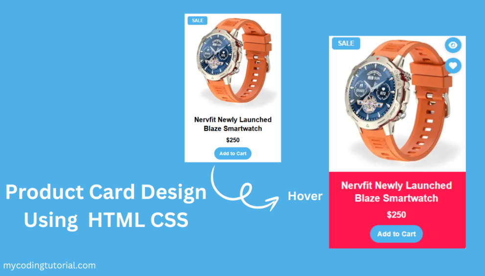
Today I created a modern Product Card Design with responsive layout, hover effects, quick view, and wishlist features.
Got it — you want a 4-column responsive product card design with:
- Product image
- On hover → quick view & wishlist icons
- Product title & price
- Add to cart button
- Fully responsive layout (will stack on smaller screens)
Create index.html file and copy code and paste code our layout.
<!DOCTYPE html>
<html lang="en">
<head>
<meta charset="UTF-8">
<meta name="viewport" content="width=device-width, initial-scale=1.0">
<title>Product Card Design By Mycodingtutorial</title>
<link rel="stylesheet" href="style.css">
<!-- Font Awesome for icons -->
<link rel="stylesheet" href="https://cdnjs.cloudflare.com/ajax/libs/font-awesome/6.4.0/css/all.min.css">
</head>
<body>
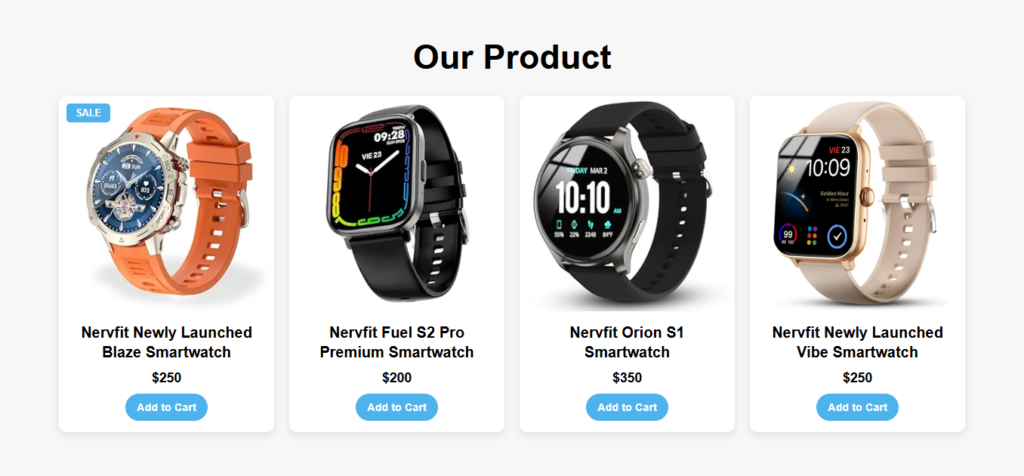
<h1 class="title">Our Product</h1>
<div class="product-grid">
<!-- Product Card -->
<div class="product-card">
<div class="product-image">
<span class="sale-tag">SALE</span>
<img src="image/41iIOwrE-vL._SX300_SY300_QL70_FMwebp_.webp" alt="Product">
<div class="product-icons">
<a href="#" data-title="Quick View"><i class="fa fa-eye"></i></a>
<a href="#" data-title="Wishlist"><i class="fa fa-heart"></i></a>
</div>
</div>
<div class="product-details">
<h3>Nervfit Newly Launched Blaze Smartwatch</h3>
<div class="price">$250</div>
<button class="add-to-cart">Add to Cart</button>
</div>
</div>
<!-- Repeat -->
<div class="product-card">
<div class="product-image">
<img src="image/41otGsxjMnL._SX300_SY300_QL70_FMwebp_.webp" alt="Product">
<div class="product-icons">
<a href="#" data-title="Quick View"><i class="fa fa-eye"></i></a>
<a href="#" data-title="Wishlist"><i class="fa fa-heart"></i></a>
</div>
</div>
<div class="product-details">
<h3>Nervfit Fuel S2 Pro Premium Smartwatch</h3>
<div class="price">$200</div>
<button class="add-to-cart">Add to Cart</button>
</div>
</div>
<div class="product-card">
<div class="product-image">
<img src="image/41Q8y31By+L._SY300_SX300_.jpg" alt="Product">
<div class="product-icons">
<a href="#" data-title="Quick View"><i class="fa fa-eye"></i></a>
<a href="#" data-title="Wishlist"><i class="fa fa-heart"></i></a>
</div>
</div>
<div class="product-details">
<h3>Nervfit Orion S1 Smartwatch</h3>
<div class="price">$350</div>
<button class="add-to-cart">Add to Cart</button>
</div>
</div>
<div class="product-card">
<div class="product-image">
<img src="image/61CkjAEi41L._SL1500_.jpg" alt="Product">
<div class="product-icons">
<a href="#" data-title="Quick View"><i class="fa fa-eye"></i></a>
<a href="#" data-title="Wishlist"><i class="fa fa-heart"></i></a>
</div>
</div>
<div class="product-details">
<h3>Nervfit Newly Launched Vibe Smartwatch</h3>
<div class="price">$250</div>
<button class="add-to-cart">Add to Cart</button>
</div>
</div>
</div>
</body>
</html>
You will also like this post
- Designing Stunning Team Member Card with HTML & CSS
- Responsive Service Card Design HTML & CSS
- Responsive Service Card Design using HTML & CSS
- Pricing Table CSS: Simple Tricks for a Better Design.
- Simple Code Tricks to Make Your Postcard Slider Look Better
Create style.css file and copy code and paste code our layout.
* {
    margin: 0;
    padding: 0;
    box-sizing: border-box;
    font-family: Arial, sans-serif;
}

body {
    background: #f7f7f7;
    padding: 20px;
}

.product-grid {
    display: grid;
    grid-template-columns: repeat(auto-fit, minmax(280px, 1fr));
    gap: 20px;
    max-width: 1200px;
    margin: auto;
}

.product-card {
    background: #fff;
    border-radius: 10px;
    overflow: hidden;
    box-shadow: 0 4px 10px rgba(0,0,0,0.1);
    transition: transform 0.3s ease;
    position: relative;
}

.product-card:hover {
    transform: translateY(-5px);
    background-color: #ff184e;
}

h1.title {
    text-align: center;
    font-size: 45px;
    margin-bottom: 25px;
    margin-top: 30px;
}

.product-image {
    position: relative;
    overflow: hidden;

}

.product-image img {
    width: 100%;
    display: block;
}

/* Hover icons */
.product-icons {
    position: absolute;
    top: 10px;
    right: 10px;
    display: flex;
    flex-direction: column;
    gap: 10px;
    opacity: 0;
    transform: translateY(-10px);
    transition: all 0.3s ease;
}

.product-card:hover .product-icons {
    opacity: 1;
    transform: translateY(0);
}

/* Tooltip style */
.product-icons a {
position: relative;
background: #4eb2ec;
padding: 8px;
border-radius: 50%;
display: flex;
justify-content: center;
align-items: center;
color: #fff;
text-decoration: none;
box-shadow: 0 2px 6px rgba(0,0,0,0.1);
transition: background 0.3s;
font-size: 16px;
}

.product-icons a:hover {
background: #ff184e;
}

/* Tooltip text */
.product-icons a::after {
content: attr(data-title);
position: absolute;
right: 110%;
top: 50%;
transform: translateY(-50%);
background: #ff184e;
color: #fff;
font-size: 12px;
padding: 4px 8px;
border-radius: 4px;
opacity: 0;
pointer-events: none;
white-space: nowrap;
transition: opacity 0.3s ease, right 0.3s ease;
}

/* Show tooltip on hover */
.product-icons a:hover::after {
opacity: 1;
right: 130%;
}

.product-details {
    padding: 15px;
    text-align: center;
}

.product-details h3 {
    font-size: 20px;
    line-height: 1.3em;
    color: #000000;
    margin-bottom: 11px;
}

.product-card:hover .product-details h3 {
    color: #fff;
}

.product-card:hover .product-details .price {
    color: #fff;
}

.price {
    font-size: 1.1rem;
    font-weight: bold;
    color: #000;
    margin-bottom: 10px;
}

.add-to-cart {
    background: #4eb2ec;
    color: #fff;
    padding: 10px 15px;
    font-size: 16px;
    font-weight: 600;
    border: none;
    cursor: pointer;
    font-size: 0.9rem;
    border-radius: 50px;
    transition: background 0.3s ease;
}

.add-to-cart:hover {
    background: #fff;
    color: #ff184e;
}

/* SALE tag */
.sale-tag {
    position: absolute;
    top: 10px;
    left: 10px;
    background: #4eb2ec;
    color: #fff;
    padding: 5px 12px;
    font-size: 0.8rem;
    font-weight: bold;
    border-radius: 5px;
    z-index: 2;
}
Features in this design:
- Responsive 3-column layout using CSS Grid (
auto-fitfor flexibility) - Quick View & Wishlist buttons appear only on hover
- Modern button styles for Add to Cart
- Works perfectly on mobile, tablet, and desktop
- SALE tag in top-left corner