
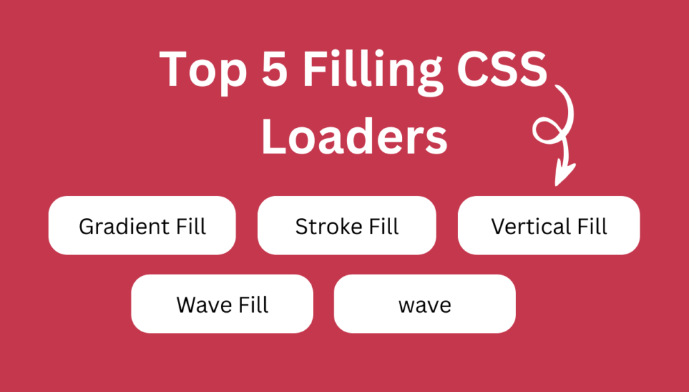
Here’s a collection of responsive “Filling CSS Loaders” you can use with just HTML + CSS. Each example automatically scales with the viewport.
Gradient Filling Loader
1. Gradient Fill (gradient-fill.html)
<!DOCTYPE html>
<html lang="en">
<head>
  <meta charset="UTF-8">
  <title>Gradient Fill By Mycodingtutorial</title>
  <style>
    body {
      margin: 0; display: flex; justify-content: center; align-items: center;
      min-height: 100vh; background: #111; font-family: Arial, sans-serif;
    }
    h1 {
      font-size: clamp(2rem, 6vw, 6rem);
      font-weight: 900;
      background: linear-gradient(90deg, #4facfe, #00f2fe);
      -webkit-background-clip: text;
      background-clip: text;
      color: transparent;
      background-size: 200% auto;
      animation: gradientFlow 3s linear infinite;
    }
    @keyframes gradientFlow {
      0% { background-position: 0% 50%; }
      100% { background-position: 100% 50%; }
    }
  </style>
</head>
<body>
  <h1>Mycodingtutorial</h1>
</body>
</html>
Stroke Filling Loader
2. Stroke to Fill (stroke-fill.html)
<!DOCTYPE html>
<html lang="en">
<head>
  <meta charset="UTF-8">
  <title>Stroke Fill By Mycodingtutorial</title>
  <style>
    body {
      margin: 0; display: flex; justify-content: center; align-items: center;
      min-height: 100vh; background: #111; font-family: Arial, sans-serif;
    }
    h1 {
      font-size: clamp(2rem, 6vw, 6rem);
      font-weight: 900;
      color: transparent;
      -webkit-text-stroke: 1px #4facfe;
      position: relative;
      overflow: hidden;
    }
    h1::before {
      content: "Mycodingtutorial";
      position: absolute; left: 0; top: 0;
      width: 100%; height: 100%;
      color: #4facfe;
      clip-path: inset(0 100% 0 0);
      animation: strokeFill 3s linear infinite;
    }
    @keyframes strokeFill {
      0% { clip-path: inset(0 100% 0 0); }
      50% { clip-path: inset(0 0 0 0); }
      100% { clip-path: inset(0 100% 0 0); }
    }
  </style>
</head>
<body>
  <h1>Mycodingtutorial</h1>
</body>
</html>
Vertical Fill Loader
3. Vertical Fill (vertical-fill.html)
<!DOCTYPE html>
<html lang="en">
<head>
  <meta charset="UTF-8">
  <title>Vertical Fill By Mycodingtutorial</title>
  <style>
    body {
      margin: 0; display: flex; justify-content: center; align-items: center;
      min-height: 100vh; background: #111; font-family: Arial, sans-serif;
    }
    h1 {
      font-size: clamp(2rem, 6vw, 6rem);
      font-weight: 900;
      color: transparent;
      -webkit-text-stroke: 1px #4facfe;
      position: relative;
      overflow: hidden;
    }
    h1::before {
      content: "Mycodingtutorial";
      position: absolute; left: 0; top: 100%;
      width: 100%; height: 100%;
      color: #4facfe;
      animation: fillY 3s linear infinite;
    }
    @keyframes fillY {
      0% { top: 100%; }
      50% { top: 0%; }
      100% { top: 100%; }
    }
  </style>
</head>
<body>
  <h1>Mycodingtutorial</h1>
</body>
</html>
Wave Fill Loader
4. Wave Fill (wave-fill.html)
<!DOCTYPE html>
<html lang="en">
<head>
  <meta charset="UTF-8">
  <title>Wave Fill By Mycodingtutorial</title>
  <style>
    body {
      margin: 0; display: flex; justify-content: center; align-items: center;
      min-height: 100vh; background: #111; font-family: Arial, sans-serif;
    }
    h1 {
      font-size: clamp(2rem, 6vw, 6rem);
      font-weight: 900;
      color: transparent;
      -webkit-text-stroke: 1px #4facfe;
      position: relative;
      overflow: hidden;
    }
    h1::before {
      content: "Mycodingtutorial";
      position: absolute; left: 0; top: 0;
      width: 100%; height: 100%;
      background: repeating-linear-gradient(
        -45deg, #4facfe 0 10px, transparent 10px 20px
      );
      -webkit-background-clip: text;
      background-clip: text;
      color: transparent;
      animation: waveMove 2s linear infinite;
    }
    @keyframes waveMove {
      0% { background-position: 0 0; }
      100% { background-position: 40px 40px; }
    }
  </style>
</head>
<body>
  <h1>Mycodingtutorial</h1>
</body>
</html>
Sea Wave Fill Loader
5. Sea Wave (sea-wave.html)
<!DOCTYPE html>
<html lang="en">
<head>
  <meta charset="UTF-8">
  <meta name="viewport" content="width=device-width, initial-scale=1.0">
  <title>Wave Loader</title>
  <style>
    body {
      margin: 0;
      height: 100vh;
      display: flex;
      justify-content: center;
      align-items: center;
      background: #111;
    }

    .wave-loader::before {
      content: "Mycodingtutorial";
    }

    .wave-loader {
      font-size: 70px;
      font-family: system-ui, sans-serif;
      font-weight: bold;
      text-transform: uppercase;
      color: #0000; /* transparent text */
      -webkit-text-stroke: 1px #4facfe; /* outline */
      background:
        radial-gradient(1.13em at 50% 1.6em, #4facfe 99%, #0000 101%) calc(50% - 1.6em) 0/3.2em 100% text,
        radial-gradient(1.13em at 50% -0.8em, #0000 99%, #4facfe 101%) 50% .8em/3.2em 100% repeat-x text;
      animation: waveAnim 2s linear infinite;
    }

    @keyframes waveAnim {
      to {
        background-position: calc(50% + 1.6em) 0, calc(50% + 3.2em) .8em;
      }
    }
    @media only screen and (max-width: 600px) {
  .wave-loader {
    font-size: 34px;
    }
}

  </style>
</head>
<body>
  <div class="wave-loader"></div>
</body>
</html>