
Today create Responsive Header that adjusts to all screen sizes (desktop, tablet, mobile), follow this simple structure using HTML and CSS.
Create index.html file and copy code and paste code our layout.
<!DOCTYPE html>
<html lang="en">
<head>
<meta charset="UTF-8" />
<meta name="viewport" content="width=device-width, initial-scale=1.0"/>
<title>Responsive Header with Top Bar By mycodingtutorial</title>
<link rel="stylesheet" href="style.css">
<link rel="stylesheet" href="https://cdnjs.cloudflare.com/ajax/libs/font-awesome/6.5.0/css/all.min.css">
</head>
<body>
<!-- Top Bar -->
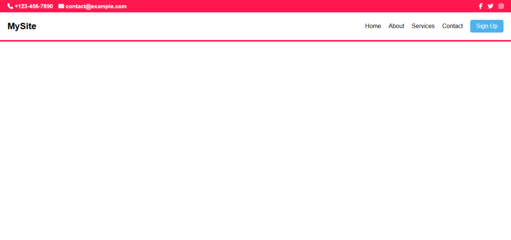
<div class="top-bar">
<div class="contact-info">
<span><i class="fas fa-phone"></i> +123-456-7890</span>
<span><i class="fas fa-envelope"></i> contact@example.com</span>
</div>
<div class="social-icons">
<a href="#"><i class="fab fa-facebook-f"></i></a>
<a href="#"><i class="fab fa-twitter"></i></a>
<a href="#"><i class="fab fa-instagram"></i></a>
</div>
</div>
<!-- Header -->
<header>
<div class="logo">MySite</div>
<div class="menu-toggle" onclick="toggleMenu()">
<span></span>
<span></span>
<span></span>
</div>
<nav id="nav">
<a href="#">Home</a>
<a href="#">About</a>
<a href="#">Services</a>
<a href="#">Contact</a>
<a href="#" class="btn">Sign Up</a>
</nav>
</header>
<script>
function toggleMenu() {
document.getElementById('nav').classList.toggle('show');
}
</script>
</body>
</html>
You will also like this post
- How to Make Your Sticky Navigation Bar Mobile-Friendly
- How To Create Sidebar Header HTML & CSS
- Responsive Navbar Using HTML CSS And JavaScript
- Responsive Navbar Using HTML CSS
Create style.css file and copy code and paste code our layout.
   * {
      margin: 0;
      padding: 0;
      box-sizing: border-box;
    }

    body {
      font-family: Arial, sans-serif;
    }

    /* Top Bar */
    .top-bar {
    background-color: #ff184e;
    color: #fff;
    padding: 8px 20px;
    display: flex;
    justify-content: space-between;
    align-items: center;
    font-size: 15px;
    font-weight: 600;
    }

    .top-bar .contact-info {
      display: flex;
      gap: 15px;
    }

    .top-bar .social-icons a {
      color: white;
      margin-left: 10px;
      text-decoration: none;
      transition: color 0.3s;
    }

    .top-bar .social-icons a:hover {
      color: #00bcd4;
    }

    /* Header */
    header {
      background-color: #ffffff;
      color: #fff;
      padding: 20px 20px;
      display: flex;
      justify-content: space-between;
      border-bottom: 4px solid #ff184e;
      align-items: center;
      position: relative;
    }

    .logo {
      font-size: 24px;
      font-weight: bold;
      color: #000;
    }

    nav#nav a {
    color: #000;
    text-decoration: none;
    font-size: 16px;
    }
    nav#nav a:Hover {
    color: #ff184e;
    font-size: 16px;
    text-decoration: none;
    }

    nav {
      display: flex;
      gap: 20px;
      align-items: center;
    }


    nav a:hover {
      color: #00bcd4;
    }

    .btn {
      background-color: #4eb2ec;
      color: white !important;
      border: none;
      padding: 8px 16px;
      border-radius: 5px;
      cursor: pointer;
      font-size: 15px;
      transition: background 0.3s;
      text-decoration: none;
    }

    .btn:hover {
      background-color: #ff184e;
    }

    .menu-toggle {
      display: none;
      flex-direction: column;
      cursor: pointer;
    }

    .menu-toggle span {
      height: 3px;
      width: 25px;
      background: #ff184e;
      margin: 4px 0;
      transition: 0.3s;
    }

    @media (max-width: 768px) {
      .top-bar {
        flex-direction: column;
        align-items: flex-start;
        font-size: 12px;
        display: none;
      }
       nav#nav a {
    color: #fff;
    text-decoration: none;
    font-size: 16px;
    }
    nav {
    display: none;
    flex-direction: column;
    background: #333;
    position: absolute;
    top: 60px;
    left: 0;
    right: 0;
    text-align: center;
    padding: 10px 0;
    }

    nav.show {
        display: flex;
        background: #000;
    }

      .menu-toggle {
        display: flex;
      }
    }