
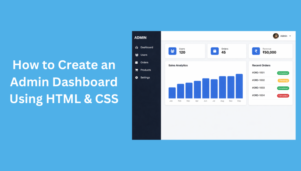
This admin dashboard is created using HTML and CSS with a clean and modern design. It includes a left sidebar menu, a top navigation bar with logo and profile section, and a main content area.
The dashboard page shows summary cards for Users, Orders, and Revenue, along with a Sales Analytics bar chart displaying monthly data from January to December. There is also a Recent Orders section showing order status such as completed, pending, and cancelled.
The sidebar menu allows navigation between different pages like Dashboard, Users, Orders, Products, and Settings. When a menu item is clicked, the related page content is displayed with a heading, while other pages remain hidden. This page switching is handled using CSS only, without JavaScript.
The layout is fully responsive. On mobile devices, the sidebar hides and can be opened using the menu icon in the top bar. The design uses Font Awesome icons, CSS Grid, and Flexbox to keep the layout simple and flexible.
Overall, this dashboard is suitable for learning purposes, admin panels, or as a base layout for web applications.
index.html
<!DOCTYPE html>
<html lang="en">
<head>
<meta charset="UTF-8">
<title>Admin Dashboard</title>
<meta name="viewport" content="width=device-width, initial-scale=1.0">

<!-- Font Awesome -->
<link rel="stylesheet"
href="https://cdnjs.cloudflare.com/ajax/libs/font-awesome/6.5.1/css/all.min.css">

 <link rel="stylesheet" href="style.css">
</head>

<body>

<!-- SIDEBAR -->
<aside class="sidebar" id="sidebar">
    <div class="sidebar-header">
        <span class="sidebar-logo">ADMIN</span>
        <span class="close-icon" onclick="toggleSidebar()">✕</span>
    </div>

    <ul>
        <li><a href="#dashboard"><i class="fas fa-home"></i> Dashboard</a></li>
        <li><a href="#users"><i class="fas fa-users"></i> Users</a></li>
        <li><a href="#orders"><i class="fas fa-box"></i> Orders</a></li>
        <li><a href="#products"><i class="fas fa-cart-shopping"></i> Products</a></li>
        <li><a href="#settings"><i class="fas fa-gear"></i> Settings</a></li>
    </ul>
</aside>

<!-- MAIN -->
<div class="main">

<header class="topbar">

    <!-- LEFT -->
    <div class="topbar-left">
        <span class="menu-icon" onclick="toggleSidebar()">☰</span>
        <span class="logo">Mycodingtutorial</span>
    </div>

    <!-- RIGHT -->
    <div class="topbar-right">
        <div class="profile">
            <img src="https://i.pravatar.cc/40" alt="Profile">
            <span>Admin ▾</span>

            <div class="profile-menu">
                <a href="#"><i class="fas fa-user"></i> My Account</a>
                <a href="#"><i class="fas fa-right-from-bracket"></i> Logout</a>
            </div>
        </div>
    </div>

</header>


<!-- CONTENT -->
<section class="content">

    <!-- DASHBOARD -->
    <!-- DASHBOARD -->
    <section id="dashboard" class="page">

        <!-- STATS CARDS -->
        <div class="cards">
            <div class="card card-flex">
                <div class="icon-box"><i class="fas fa-users"></i></div>
                <div class="text-box">
                    <span>Users</span>
                    <strong>120</strong>
                </div>
            </div>

            <div class="card card-flex">
                <div class="icon-box"><i class="fas fa-box"></i></div>
                <div class="text-box">
                    <span>Orders</span>
                    <strong>45</strong>
                </div>
            </div>

            <div class="card card-flex">
                <div class="icon-box"><i class="fas fa-indian-rupee-sign"></i></div>
                <div class="text-box">
                    <span>Revenue</span>
                    <strong>₹50,000</strong>
                </div>
            </div>
        </div>

        <!-- SALES + ORDERS -->
        <div class="dashboard-grid">

            <!-- SALES ANALYTICS -->
            <div class="card">
                <h3 class="card-title">Sales Analytics</h3>

                <div class="chart">
                    <div class="bar" style="height:40%"></div>
                    <div class="bar" style="height:55%"></div>
                    <div class="bar" style="height:50%"></div>
                    <div class="bar" style="height:65%"></div>
                    <div class="bar" style="height:60%"></div>
                    <div class="bar" style="height:75%"></div>
                    <div class="bar" style="height:70%"></div>
                    <div class="bar" style="height:85%"></div>
                    <div class="bar" style="height:80%"></div>
                    <div class="bar" style="height:90%"></div>
                    <div class="bar" style="height:88%"></div>
                    <div class="bar" style="height:95%"></div>
                </div>

                <div class="chart-labels">
                    <span>Jan</span><span>Feb</span><span>Mar</span>
                    <span>Apr</span><span>May</span><span>Jun</span>
                    <span>Jul</span><span>Aug</span><span>Sep</span>
                    <span>Oct</span><span>Nov</span><span>Dec</span>
                </div>
            </div>

            <!-- RECENT ORDERS -->
            <div class="card">
                <h3 class="card-title">Recent Orders</h3>

                <ul class="order-list">
                    <li>
                        <span>#ORD-1001</span>
                        <span class="status success">Completed</span>
                    </li>
                    <li>
                        <span>#ORD-1002</span>
                        <span class="status pending">Pending</span>
                    </li>
                    <li>
                        <span>#ORD-1003</span>
                        <span class="status success">Completed</span>
                    </li>
                    <li>
                        <span>#ORD-1004</span>
                        <span class="status cancel">Cancelled</span>
                    </li>
                </ul>
            </div>

        </div>
    </section>


    <!-- USERS -->
    <section id="users" class="page">
        <h2 class="page-title">Users</h2>
        <div class="card">
            This is the Users page.
        </div>
    </section>

    <!-- ORDERS -->
    <section id="orders" class="page">
        <h2 class="page-title">Orders</h2>
        <div class="card">
            This is the Orders page.
        </div>
    </section>

    <!-- PRODUCTS -->
    <section id="products" class="page">
        <h2 class="page-title">Products</h2>
        <div class="card">
            This is the Products page.
        </div>
    </section>

    <!-- SETTINGS -->
    <section id="settings" class="page">
        <h2 class="page-title">Settings</h2>
        <div class="card">
            This is the Settings page.
        </div>
    </section>

</section>

</div>

<script>
function toggleSidebar() {
    document.getElementById("sidebar").classList.toggle("active");
}
</script>

</body>
</html>
style.css
* {
    margin: 0;
    padding: 0;
    box-sizing: border-box;
    font-family: Arial, sans-serif;
}

body {
    background: #f4f6f9;
}

/* ================= SIDEBAR ================= */
.sidebar {
    position: fixed;
    top: 0;
    left: 0;
    width: 240px;
    height: 100%;
    background: #111827;
    color: #fff;
    padding: 20px;
    transition: transform 0.3s ease;
    z-index: 1000;
}

.sidebar-header {
    display: flex;
    justify-content: space-between;
    align-items: center;
    margin-bottom: 30px;
}

.sidebar-logo {
    font-size: 22px;
    font-weight: bold;
}

.close-icon {
    font-size: 22px;
    cursor: pointer;
    display: none;
}

.sidebar ul {
    list-style: none;
}

.sidebar ul li a {
    padding: 12px;
    margin-bottom: 10px;
    border-radius: 6px;
    cursor: pointer;
    display: flex;
    align-items: center;
    gap: 12px;
    color: #fff;
    text-decoration: none;
}

.sidebar ul li a:hover {
    background: #1f2937;
}

/* ================= MAIN ================= */
.main {
    margin-left: 240px;
    min-height: 100vh;
}

/* ================= TOPBAR LAYOUT ================= */
.topbar {
    height: 60px;
    background: #fff;
    padding: 0 20px;
    display: flex;
    align-items: center;
    justify-content: space-between;
    box-shadow: 0 2px 6px rgba(0,0,0,0.1);
}

.topbar-left {
    display: flex;
    align-items: center;
    gap: 15px;
}

.topbar-right {
    display: flex;
    align-items: center;
}

/* Logo */
.logo {
    font-weight: bold;
    font-size: 18px;
}

/* Menu icon */
.menu-icon {
    font-size: 24px;
    cursor: pointer;
    display: none;
}


/* ================= PROFILE ================= */
.profile {
    position: relative;
    display: flex;
    align-items: center;
    gap: 8px;
    cursor: pointer;
}

.profile img {
    width: 36px;
    height: 36px;
    border-radius: 50%;
}

.profile span {
    font-size: 14px;
    font-weight: 500;
}

/* Dropdown menu */
.profile-menu {
    position: absolute;
    top: 110%;
    right: 0;
    background: #fff;
    width: 180px;
    border-radius: 8px;
    box-shadow: 0 6px 20px rgba(0,0,0,0.15);
    display: none;
    overflow: hidden;
    z-index: 999;
}

.profile-menu a {
    display: flex;
    align-items: center;
    gap: 10px;
    padding: 12px 14px;
    color: #333;
    text-decoration: none;
    font-size: 14px;
}

.profile-menu a:hover {
    background: #f4f6f9;
}

/* Show menu on hover (CSS only) */
.profile:hover .profile-menu {
    display: block;
}

/* ================= DASHBOARD EXTRA ================= */

.dashboard-grid {
    margin-top: 20px;
    display: grid;
    grid-template-columns: 2fr 1fr;
    gap: 20px;
}

/* Card title */
.card-title {
    font-size: 16px;
    margin-bottom: 15px;
    font-weight: bold;
}

/* SALES CHART */
.chart {
    display: flex;
    align-items: flex-end;
    gap: 10px;
    height: 160px;
    margin-bottom: 10px;
}

.chart .bar {
    flex: 1;
    background: #2563eb;
    border-radius: 6px 6px 0 0;
}

.chart-labels {
    display: flex;
    justify-content: space-between;
    font-size: 12px;
    color: #666;
}

/* RECENT ORDERS */
.order-list {
    list-style: none;
}

.order-list li {
    display: flex;
    justify-content: space-between;
    padding: 10px 0;
    border-bottom: 1px solid #eee;
    font-size: 14px;
}

.status {
    padding: 4px 8px;
    border-radius: 12px;
    font-size: 12px;
    color: #fff;
}

.status.success {
    background: #16a34a;
}

.status.pending {
    background: #f59e0b;
}

.status.cancel {
    background: #dc2626;
}

/* Responsive */
@media (max-width: 768px) {
    .dashboard-grid {
        grid-template-columns: 1fr;
    }
}


/* ================= CONTENT ================= */
.content {
    padding: 20px;
}

/* Hide all pages by default */
.page {
    display: none;
}

/* Show dashboard when NO hash is in URL */
.content:not(:has(:target)) #dashboard {
    display: block;
}

/* Show only the clicked page */
.page:target {
    display: block;
}


/* Page title */
.page-title {
    font-size: 24px;
    font-weight: bold;
    margin-bottom: 20px;
}

/* Dashboard cards */
.cards {
    display: grid;
    grid-template-columns: repeat(auto-fit, minmax(220px, 1fr));
    gap: 20px;
}

.card {
    background: #fff;
    padding: 20px;
    border-radius: 8px;
    box-shadow: 0 2px 8px rgba(0,0,0,0.1);
}

/* Card layout */
.card-flex {
    display: flex;
    align-items: center;
    gap: 16px;
}

.icon-box {
    width: 52px;
    height: 52px;
    background: #2563eb;
    color: #fff;
    border-radius: 10px;
    display: flex;
    align-items: center;
    justify-content: center;
    font-size: 22px;
}

.text-box span {
    font-size: 14px;
    color: #666;
}

.text-box strong {
    font-size: 22px;
    display: block;
}

/* ================= MOBILE ================= */
@media (max-width: 768px) {
    .sidebar {
        transform: translateX(-100%);
    }

    .sidebar.active {
        transform: translateX(0);
    }

    .main {
        margin-left: 0;
    }

    .menu-icon {
        display: block;
    }

    .close-icon {
        display: block;
    }
}
Final Words
This admin dashboard layout is a great starting point for beginners who want to understand how to build a clean and responsive interface using HTML and CSS only. While it does not include dynamic data or backend functionality, it provides a solid foundation that can be extended with JavaScript, APIs, and server-side logic in the future. With further enhancements, this layout can be transformed into a fully functional admin panel for real-world applications.