
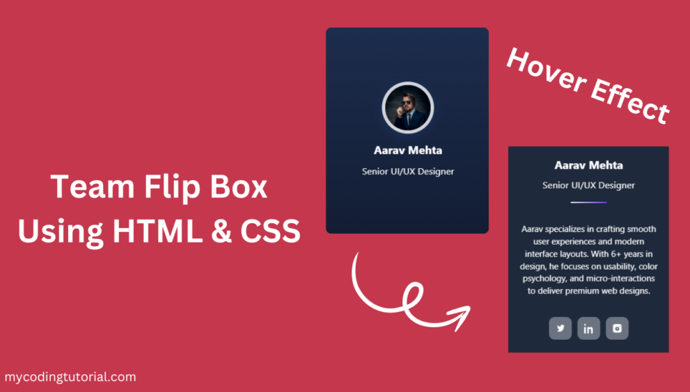
Today you’ll build a clean, responsive team flip box layout using only HTML and CSS. Each card shows the member’s name and position on the front and reveals a short bio and social links on the back. The layout uses a 3-column grid on desktop, 2 columns on tablets, and 1 column on mobile, HTML CSS Flip Box is keyboard-accessible, lightweight (no JavaScript required), and easy to customize for any team or portfolio page.
Key features
- Simple front/back flip structure (HTML + CSS only)
- Responsive grid: 3 / 2 / 1 columns for desktop / tablet / mobile
- Accessible:
tabindexandariaattributes included - Easy to edit: swap images, names, positions, bios, and social links
- Dark theme ready (colors in CSS variables for quick theming)
Create index.html file and copy code and paste code our layout.
<!doctype html>
<html lang="en">
<head>
  <meta charset="utf-8" />
  <meta name="viewport" content="width=device-width, initial-scale=1" />
  <title>Team Flip Box — Using HTML/CSS By Mycodingtutorial </title>
  <link rel="stylesheet" href="style.css">
</head>
<body>

  <div class="grid">

    <!-- Flip card (copy this block to create more) -->
    <div class="flip-card" tabindex="0" aria-label="Profile card: Aarav Mehta, Senior UI/UX Designer">
      <div class="flip-card__inner">

        <!-- FRONT -->
        <div class="flip-face flip-face--front">
          <div class="avatar">
            <img src="Aarav Mehta.jpg" alt="Aarav Mehta">
          </div>
          <h3 class="name">Aarav Mehta</h3>
          <p class="position">Senior UI/UX Designer</p>
        </div>

        <!-- BACK -->
        <div class="flip-face flip-face--back">
          <h3 class="name">Aarav Mehta</h3>
          <p class="position">Senior UI/UX Designer</p>

          <div class="divider" aria-hidden="true"></div>

          <p class="bio">Aarav specializes in crafting smooth user experiences and modern interface layouts. With 6+ years in design, he focuses on usability, color psychology, and micro-interactions to deliver premium web designs.</p>

          <div class="socials" aria-label="Social links">
            <a href="#" title="Twitter" aria-label="Twitter">
              <!-- Twitter SVG -->
              <svg viewBox="0 0 24 24" fill="currentColor" aria-hidden="true"><path d="M22 5.92c-.64.28-1.32.47-2.04.55.73-.44 1.28-1.14 1.54-1.98-.68.4-1.44.7-2.24.86A3.53 3.53 0 0 0 12.8 8.5a10.03 10.03 0 0 1-7.28-3.7 3.53 3.53 0 0 0 1.09 4.72c-.6-.02-1.17-.18-1.66-.45v.05c0 1.68 1.18 3.09 2.74 3.42-.47.12-.96.14-1.46.06.41 1.3 1.6 2.24 3.01 2.27A7.07 7.07 0 0 1 4 18.57a10 10 0 0 0 5.4 1.58c6.5 0 10.06-5.39 10.06-10.06v-.46c.68-.5 1.26-1.12 1.72-1.83-.62.28-1.3.48-2 .57z"/></svg>
            </a>

            <a href="#" title="LinkedIn" aria-label="LinkedIn">
              <!-- LinkedIn SVG -->
              <svg viewBox="0 0 24 24" fill="currentColor" aria-hidden="true"><path d="M4.98 3.5c0 1.12-.9 2.02-2.01 2.02A2.01 2.01 0 0 1 .96 3.5C.96 2.38 1.86 1.5 2.98 1.5c1.1 0 2 .88 2 .99zM.96 8.98h4.04V24H.96V8.98zM8.66 8.98h3.88v2.06h.05c.54-1.02 1.86-2.1 3.83-2.1 4.1 0 4.86 2.7 4.86 6.2V24h-4.08v-7.12c0-1.7-.03-3.89-2.37-3.89-2.4 0-2.76 1.87-2.76 3.79V24H8.66V8.98z"/></svg>
            </a>

            <a href="#" title="Instagram" aria-label="Instagram">
              <!-- Instagram SVG -->
              <svg viewBox="0 0 24 24" fill="currentColor" aria-hidden="true"><path d="M7 2h10a5 5 0 0 1 5 5v10a5 5 0 0 1-5 5H7a5 5 0 0 1-5-5V7a5 5 0 0 1 5-5zm5 6.2A4.8 4.8 0 1 0 16.8 13 4.8 4.8 0 0 0 12 8.2zM18.4 6.1a1.1 1.1 0 1 0 1.1 1.1 1.09 1.09 0 0 0-1.1-1.1zM12 10.6a1.4 1.4 0 1 1-1.4 1.4A1.4 1.4 0 0 1 12 10.6z"/></svg>
            </a>
          </div>

        </div>

      </div>
    </div>

    <!-- Example: Another card with different content (copy/modify) -->
    <div class="flip-card" tabindex="0" aria-label="Profile card: Riya Kapoor, Full-Stack Developer">
      <div class="flip-card__inner">
        <div class="flip-face flip-face--front">
          <div class="avatar">
            <img src="Riya Kapoor.jpg" alt="Riya Kapoor">
          </div>
          <h3 class="name">Riya Kapoor</h3>
          <p class="position">Full-Stack Developer</p>
        </div>
        <div class="flip-face flip-face--back">
          <h3 class="name">Riya Kapoor</h3>
          <p class="position">Full-Stack Developer</p>
          <div class="divider" aria-hidden="true"></div>
          <p class="bio">Riya is a versatile developer skilled in both frontend and backend technologies. She builds secure, scalable, and high-performance web applications with clean code and modern frameworks.</p>
          <div class="socials" aria-label="Social links">
            <a href="#" title="Twitter" aria-label="Twitter">
              <!-- Twitter SVG -->
              <svg viewBox="0 0 24 24" fill="currentColor" aria-hidden="true"><path d="M22 5.92c-.64.28-1.32.47-2.04.55.73-.44 1.28-1.14 1.54-1.98-.68.4-1.44.7-2.24.86A3.53 3.53 0 0 0 12.8 8.5a10.03 10.03 0 0 1-7.28-3.7 3.53 3.53 0 0 0 1.09 4.72c-.6-.02-1.17-.18-1.66-.45v.05c0 1.68 1.18 3.09 2.74 3.42-.47.12-.96.14-1.46.06.41 1.3 1.6 2.24 3.01 2.27A7.07 7.07 0 0 1 4 18.57a10 10 0 0 0 5.4 1.58c6.5 0 10.06-5.39 10.06-10.06v-.46c.68-.5 1.26-1.12 1.72-1.83-.62.28-1.3.48-2 .57z"/></svg>
            </a>

            <a href="#" title="LinkedIn" aria-label="LinkedIn">
              <!-- LinkedIn SVG -->
              <svg viewBox="0 0 24 24" fill="currentColor" aria-hidden="true"><path d="M4.98 3.5c0 1.12-.9 2.02-2.01 2.02A2.01 2.01 0 0 1 .96 3.5C.96 2.38 1.86 1.5 2.98 1.5c1.1 0 2 .88 2 .99zM.96 8.98h4.04V24H.96V8.98zM8.66 8.98h3.88v2.06h.05c.54-1.02 1.86-2.1 3.83-2.1 4.1 0 4.86 2.7 4.86 6.2V24h-4.08v-7.12c0-1.7-.03-3.89-2.37-3.89-2.4 0-2.76 1.87-2.76 3.79V24H8.66V8.98z"/></svg>
            </a>

            <a href="#" title="Instagram" aria-label="Instagram">
              <!-- Instagram SVG -->
              <svg viewBox="0 0 24 24" fill="currentColor" aria-hidden="true"><path d="M7 2h10a5 5 0 0 1 5 5v10a5 5 0 0 1-5 5H7a5 5 0 0 1-5-5V7a5 5 0 0 1 5-5zm5 6.2A4.8 4.8 0 1 0 16.8 13 4.8 4.8 0 0 0 12 8.2zM18.4 6.1a1.1 1.1 0 1 0 1.1 1.1 1.09 1.09 0 0 0-1.1-1.1zM12 10.6a1.4 1.4 0 1 1-1.4 1.4A1.4 1.4 0 0 1 12 10.6z"/></svg>
            </a>
          </div>
        </div>
      </div>
    </div>
    <div class="flip-card" tabindex="0" aria-label="Profile card: Karan Sharma, Digital Marketing Lead">
      <div class="flip-card__inner">
        <div class="flip-face flip-face--front">
          <div class="avatar">
            <img src="Karan Sharma.jpg" alt="Karan Sharma">
          </div>
          <h3 class="name">Karan Sharma</h3>
          <p class="position">Digital Marketing Lead</p>
        </div>
        <div class="flip-face flip-face--back">
          <h3 class="name">Karan Sharma</h3>
          <p class="position">Digital Marketing Lead</p>
          <div class="divider" aria-hidden="true"></div>
          <p class="bio">Karan drives brand visibility with strong SEO, social media strategy, and performance marketing. He focuses on growth-driven campaigns that boost engagement and conversions.</p>
          <div class="socials" aria-label="Social links">
            <a href="#" title="Twitter" aria-label="Twitter">
              <!-- Twitter SVG -->
              <svg viewBox="0 0 24 24" fill="currentColor" aria-hidden="true"><path d="M22 5.92c-.64.28-1.32.47-2.04.55.73-.44 1.28-1.14 1.54-1.98-.68.4-1.44.7-2.24.86A3.53 3.53 0 0 0 12.8 8.5a10.03 10.03 0 0 1-7.28-3.7 3.53 3.53 0 0 0 1.09 4.72c-.6-.02-1.17-.18-1.66-.45v.05c0 1.68 1.18 3.09 2.74 3.42-.47.12-.96.14-1.46.06.41 1.3 1.6 2.24 3.01 2.27A7.07 7.07 0 0 1 4 18.57a10 10 0 0 0 5.4 1.58c6.5 0 10.06-5.39 10.06-10.06v-.46c.68-.5 1.26-1.12 1.72-1.83-.62.28-1.3.48-2 .57z"/></svg>
            </a>

            <a href="#" title="LinkedIn" aria-label="LinkedIn">
              <!-- LinkedIn SVG -->
              <svg viewBox="0 0 24 24" fill="currentColor" aria-hidden="true"><path d="M4.98 3.5c0 1.12-.9 2.02-2.01 2.02A2.01 2.01 0 0 1 .96 3.5C.96 2.38 1.86 1.5 2.98 1.5c1.1 0 2 .88 2 .99zM.96 8.98h4.04V24H.96V8.98zM8.66 8.98h3.88v2.06h.05c.54-1.02 1.86-2.1 3.83-2.1 4.1 0 4.86 2.7 4.86 6.2V24h-4.08v-7.12c0-1.7-.03-3.89-2.37-3.89-2.4 0-2.76 1.87-2.76 3.79V24H8.66V8.98z"/></svg>
            </a>

            <a href="#" title="Instagram" aria-label="Instagram">
              <!-- Instagram SVG -->
              <svg viewBox="0 0 24 24" fill="currentColor" aria-hidden="true"><path d="M7 2h10a5 5 0 0 1 5 5v10a5 5 0 0 1-5 5H7a5 5 0 0 1-5-5V7a5 5 0 0 1 5-5zm5 6.2A4.8 4.8 0 1 0 16.8 13 4.8 4.8 0 0 0 12 8.2zM18.4 6.1a1.1 1.1 0 1 0 1.1 1.1 1.09 1.09 0 0 0-1.1-1.1zM12 10.6a1.4 1.4 0 1 1-1.4 1.4A1.4 1.4 0 0 1 12 10.6z"/></svg>
            </a>
          </div>
        </div>
      </div>
    </div>

  </div>

  <!-- No JS required for the flip effect. Replace image src and text as needed. -->
</body>
</html>
You will also like this post
- Designing Stunning Team Member Card with HTML & CSS
- Responsive Service Card Design HTML & CSS
- Responsive Service Card Design using HTML & CSS
- Pricing Table CSS: Simple Tricks for a Better Design.
- Simple Code Tricks to Make Your Postcard Slider Look Better
Create style.css file and copy code and paste code our layout.
:root{
--card-w: 300px;
--card-h: 380px;
--accent: #fff;
--muted: #6b7280;
--bg: #0f172a;
--card-bg: #1e293b;
font-family: Inter, system-ui, -apple-system, "Segoe UI", Roboto, "Helvetica Neue", Arial;
}

*{box-sizing: border-box}
body{
margin:0;
min-height:100vh;
display:flex;
align-items:center;
justify-content:center;
gap:20px;
padding:40px;
background: linear-gradient(180deg, #1e293b, #0f172a);
}

/* grid if multiple cards */
.grid{
display:grid;
grid-template-columns: repeat(3, 1fr);
gap:20px;
width:100%;
max-width:1200px;
}

.flip-card{
perspective: 1200px;
width: var(--card-w);
height: var(--card-h);
margin: 0 auto;
}

.flip-card__inner{
position:relative;
width:100%;
height:100%;
transition: transform 700ms cubic-bezier(.2,.9,.3,1);
transform-style: preserve-3d;
border-radius: 18px;
box-shadow: 0 8px 26px rgba(0,0,0,0.45);
cursor:pointer;
background: transparent;
}

/* Flip on hover or when focused (keyboard accessible) */
.flip-card:hover .flip-card__inner{ transform: rotateY(180deg) scale(1.05); box-shadow:0 16px 40px rgba(0,0,0,0.7);
transform: rotateY(180deg);
}

.flip-face{
position:absolute;
inset:0;
backface-visibility: hidden;
border-radius: 18px;
overflow: hidden;
display:flex;
flex-direction:column;
align-items:center;
justify-content:center;
padding:22px;
background: var(--card-bg);
}

.flip-face--front{
background: linear-gradient(180deg, rgba(37,99,235,0.12), rgba(37,99,235,0.03));
gap:14px;
}

.avatar{
width:110px;
height:110px;
border-radius:50%;
overflow:hidden;
box-shadow: 0 6px 18px rgba(37,99,235,0.14);
border:6px solid rgba(255,255,255,0.8);
}
.avatar img{width:100%;display:block}

.name{
font-size:20px;
font-weight:700;
color:var(--accent);
text-align:center;
margin:0;
}
.position{
margin:0;
color:var(--accent);
font-size:16px;
font-weight:400;
letter-spacing:0.2px;
}

/* Back face */
.flip-face--back{
transform: rotateY(180deg);
gap:12px;
}

.bio{
font-size:15px;
color:var(--accent);
text-align:center;
line-height:1.45;
padding: 0 6px;
}

.divider{
width:64px;height:2px;border-radius:2px;margin:8px 0;background:linear-gradient(90deg,var(--accent),#7c3aed);
}

.socials{
display:flex;
gap:10px;
align-items:center;
justify-content:center;
margin-top:8px;
}

.socials a{
display:inline-flex;
width:40px;height:40px;
align-items:center;justify-content:center;
border-radius:10px;
text-decoration:none;
background:var(--muted);
transition: transform 180ms ease, box-shadow 180ms ease;
}
.socials a:focus{outline:2px solid rgba(37,99,235,0.18);outline-offset:3px}
.socials a:hover{transform:translateY(-4px);box-shadow:0 8px 18px rgba(2,6,23,0.06)}

.socials svg{width:18px;height:18px;display:block;fill: var(--accent);}

/* small responsive tweaks */
@media (max-width:1024px){
.grid{grid-template-columns: repeat(2, 1fr);}
}
@media (max-width:620px){
.grid{grid-template-columns: 1fr;}
:root{--card-w: 100%; --card-h: 360px}
.avatar{width:92px;height:92px}
}
.avatar{width:92px;height:92px}
Conclusion
Creating a responsive team flip box layout in HTML and CSS is a simple and effective way to showcase team members with a modern, interactive design. The structure is lightweight, loads fast, and works smoothly across all screen sizes without relying on JavaScript. With customizable colors, images, and text, this layout fits perfectly into portfolios, business websites, and service pages. Feel free to expand each card with more details or style variations to match your project’s brand and design goals.