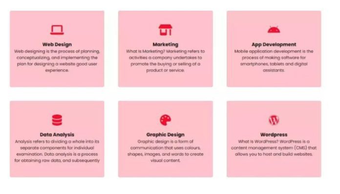
Today Create Responsive card design with hover effects has become a popular trend in web design, providing a visually appealing and interactive way to display information. This design technique utilizes HTML and CSS to create cards that adapt to different screen sizes and devices, making them accessible and user-friendly.This not only makes your website look more modern and attractive, but it also improves the user experience. In this blog post, we will explore the basics of responsive card design with hover effects using HTML and CSS.
Now, let’s dive into creating responsive cards with hover effects using HTML and CSS. In this example, we will create a simple card with a hover effect that reveals more information when the user hovers over it.
Create index.html file and copy code and paste our layout.
<!DOCTYPE html>
<html lang="en">

<head>
  <meta charset="UTF-8" />
  <meta http-equiv="X-UA-Compatible" content="IE=edge" />
  <meta name="viewport" content="width=device-width, initial-scale=1.0" />
  <title>Responsive Services Design With Hover Effect / Mycodingtutorial</title>
  <link rel="stylesheet" href="style.css" />
  <link rel="preconnect" href="https://fonts.googleapis.com" />
  <link rel="preconnect" href="https://fonts.gstatic.com" crossorigin />
  <link href="https://fonts.googleapis.com/css2?family=Poppins:wght@100;200;300;400;500;600;700;800;900&display=swap" rel="stylesheet" />
  <link rel="stylesheet" href="https://cdnjs.cloudflare.com/ajax/libs/font-awesome/6.5.1/css/all.min.css">
</head>

<body>
  <section class="container-services-card">
     <div class="space"></div>
    <div class="row">
      <div class="service">
        <i class="fa-solid fa-laptop"></i>
        <h3>Web Design</h3>
        <p>Web designing is the process of planning, conceptualizing, and implementing the plan for designing a website good user experience.</p>
      </div>
      <div class="service">
        <i class="fa-solid fa-shop"></i>
        <h3>Marketing</h3>
        <p>What Is Marketing? Marketing refers to activities a company undertakes to promote the buying or selling of a product or service.</p>
      </div>
      <div class="service">
        <i class="fa-brands fa-android"></i>
        <h3>App Development</h3>
        <p>Mobile application development is the process of making software for smartphones, tablets and digital assistants.</p>
      </div>
      <div class="service">
        <i class="fa-solid fa-database"></i>
        <h3>Data Analysis</h3>
        <p>Analysis refers to dividing a whole into its separate components for individual examination. Data analysis is a process for obtaining raw data, and subsequently </p>
      </div>
      <div class="service">
        <i class="fa-solid fa-palette"></i>
        <h3>Graphic Design</h3>
        <p>Graphic design is a form of communication that uses colours, shapes, images, and words to create visual content.</p>
      </div>
      <div class="service">
        <i class="fa-brands fa-wordpress"></i>
        <h3>Wordpress</h3>
        <p>What Is WordPress? WordPress is a content management system (CMS) that allows you to host and build websites.</p>
      </div>
    </div>
  </section>
</body>
</html>
Create style.css file and copy code and paste our layout.
* {
  padding: 0;
  margin: 0;
  -webkit-box-sizing: border-box;
  box-sizing: border-box;
  font-family: "Poppins", sans-serif;
}
.container-services-card {
  width: 100%;
  height: 100vh;
  padding: 0 8%;
}
.container-services-card .space {
  text-align: center;
  padding-top: 0%;
  margin-bottom: 25px;

}
.row {
  display: grid;
  grid-template-columns: repeat(auto-fit, minmax(250px, 1fr));
  gap: 50px;
}
.row .service {
  padding: 50px 15px;
  background: #f50d2d40;
  font-size: 15px;
  border-radius: 5px;
  text-align: center;
  cursor: pointer;
  transition: 0.5s;
}
.row .service:hover {
    color: #fff;
    background-color: #f50d2d40;
    transform: scale(1.05);
    background-image: linear-gradient( to right, #f50d2d, #f06d06);
}
.row .service i {
  color: #f50d2d;
  margin-bottom: 20px;
  font-size: 40px;
  transition: 0.5s;
}
.row .service:hover i {
  color: #fff;
}
.row .service h2 {
  font-weight: 600;
  margin-bottom: 20px;
}
From a design perspective, responsive card design with hover effects also allows for creativity and flexibility. Designers can experiment with different styles, colors, and effects to create unique and eye-catching cards that stand out from traditional static designs. This can add a touch of personality and branding to a website, making it more memorable for users.
Conclusion
In this blog post, we have explored the basics of creating responsive card design with hover effects using HTML and CSS. This is just one example, and there are many other ways to incorporate this design technique into your website. With a little bit of creativity, you can make your website more engaging and visually appealing for your users. So why not give it a try and see the difference it can make on your website?


