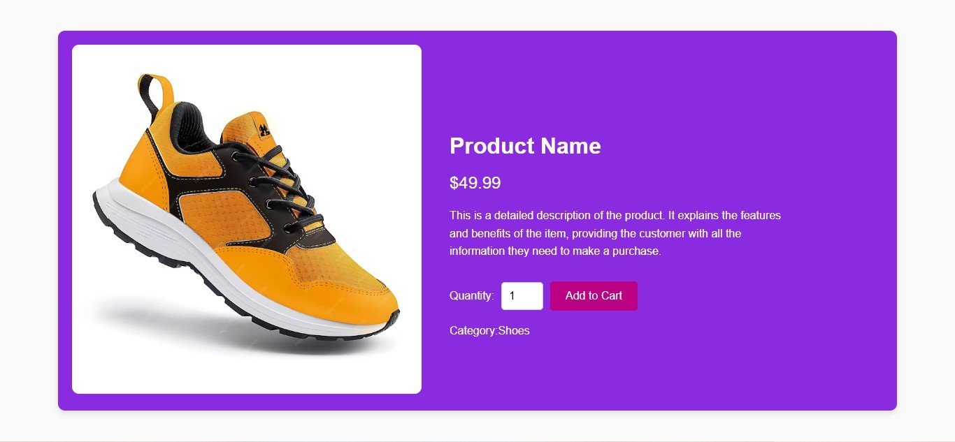
How to Build a Simple Product Page Using HTML and CSS
Here’s an example of a Simple Product Page, responsive single product page using HTML and CSS. The design includes an image, product description, price, and an “Add to Cart” button, along with some styling that adjusts according to screen size.
Create index.html file and copy code and paste code our layout.
<!DOCTYPE html>
<html lang="en">
<head>
    <meta charset="UTF-8">
    <meta name="viewport" content="width=device-width, initial-scale=1.0">
    <title>Single Product Page</title>
    <link rel="stylesheet" href="style.css">
</head>
<body>
    <div class="product-container">
        <!-- Product Image -->
        <div class="product-image">
            <img src="https://via.placeholder.com/400" alt="Product Image">
        </div>
        <!-- Product Details -->
        <div class="product-details">
            <h1 class="product-title">Product Name</h1>
            <p class="product-price">$49.99</p>
            <p class="product-description">
                This is a detailed description of the product. It explains the features and benefits of the item,
                providing the customer with all the information they need to make a purchase.
            </p>
            <div class="product-actions">
                <label for="quantity">Quantity:</label>
                <input type="number" id="quantity" name="quantity" value="1" min="1">
                <button class="add-to-cart">Add to Cart</button>
            </div>
        </div>
    </div>
</body>
</html>
Create style.css file and copy code and paste code our layout.
* {
    margin: 0;
    padding: 0;
    box-sizing: border-box;
    font-family: 'Arial', sans-serif;
}

body {
    display: flex;
    justify-content: center;
    align-items: center;
    min-height: 100vh;
    background-color: #f9f9f9;
}

.product-container {
    display: flex;
    flex-wrap: wrap;
    max-width: 1200px;
    width: 90%;
    background-color: #fff;
    box-shadow: 0 4px 8px rgba(0, 0, 0, 0.1);
    border-radius: 10px;
    overflow: hidden;
    padding: 20px;
    gap: 20px;
}

/* Product Image */
.product-image {
    flex: 1 1 40%;
    max-width: 500px;
}

.product-image img {
    width: 100%;
    border-radius: 10px;
}

/* Product Details */
.product-details {
    flex: 1 1 50%;
    max-width: 500px;
}

.product-title {
    font-size: 2rem;
    margin-bottom: 20px;
}

.product-price {
    font-size: 1.5rem;
    color: #28a745;
    margin-bottom: 20px;
}

.product-description {
    margin-bottom: 30px;
    font-size: 1rem;
    line-height: 1.6;
}

.product-actions {
    display: flex;
    align-items: center;
    gap: 10px;
}

.product-actions label {
    font-size: 1rem;
}

.product-actions input[type="number"] {
    width: 60px;
    padding: 5px;
    font-size: 1rem;
    border: 1px solid #ccc;
    border-radius: 5px;
}

.add-to-cart {
    background-color: #28a745;
    color: #fff;
    padding: 10px 20px;
    border: none;
    border-radius: 5px;
    cursor: pointer;
    font-size: 1rem;
}

.add-to-cart:hover {
    background-color: #218838;
}

/* Responsive Design */
@media (max-width: 768px) {
    .product-container {
        flex-direction: column;
        align-items: center;
    }

    .product-image, .product-details {
        flex: 1 1 100%;
        max-width: 100%;
    }

    .product-actions {
        justify-content: center;
    }
}
Explanation:
- HTML Structure:
- The page is divided into two main sections: the product image on the left and product details on the right.
- The product details include the title, price, description, and a simple quantity selector with an “Add to Cart” button.
- CSS Styling:
- The page uses
flexboxto align the product image and details side-by-side on larger screens. Each section has a flexible width (flex: 1 1 40%andflex: 1 1 50%). - The page becomes responsive by wrapping the elements into a column (
flex-direction: column) when the screen width is smaller than 768px. - The add-to-cart button changes color on hover to provide a nice user interaction.
- The page uses
This is a basic but clean and responsive single product page layout that can be extended with additional features, like a product gallery, more detailed descriptions, and user reviews.


